How to Build a Supply Chain Dashboard
Supply chain dashboards provide much-needed access to real-time insights about a whole range of interrelated inventory, cost management, and procurement processes.
The challenge is getting all of the data we need in one place and compatible formats.
Today, we’re exploring how Budibase empowers teams to build custom dashboards around all kinds of existing data sources.
Along the way, we’ll see how we can create and save custom queries to transform data and present the results in professional UIs, with minimal design skills.
But first, a bit of background.
What is a supply chain dashboard?
A dashboard is a type of reporting UI that connects to an external database. Each time users access it, they can view the most up-to-date values for whatever data we’ve configured our dashboard to display.
This achieves a few important things.
First of all, it means we don’t need to manually extract the insights we need each time we need them.
Besides this, we can greatly improve the efficiency, accuracy, and repeatability with which decision-makers can access key information.
In the specific case of a supply chain dashboard, this will largely consist of data relating to our stock changes, replenishment costs, purchase order processing, and other key inventory and procurement metrics.
But, of course, what this looks like at a more granular level will vary from one business to the next.
So…
What are we building?
Our dashboard will comprise a single-screen application that displays a variety of readouts and visualizations around how we’re spending on procurement and how this is impacting our present stock levels.
We’ll have a row of summary cards, followed by two rows of charts, comparing data points by category, item, and vendor - as well as over time.
Here’s what the finished product will look like:
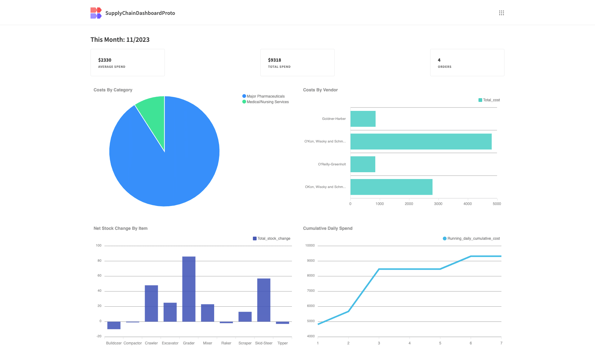
We’re going to achieve this by connecting to a PostgreSQL database which stores interrelated entities from our logistics processes.
The specific tables we’re going to query store data on our inventory and vendors, our incoming returns, shipments and consignments, and our outgoing sales.
We’ll use custom queries to extract the specific insights we need to populate our supply chain dashboard from across these tables.
So, let’s jump right in.
How to build a supply chain dashboard in 6 steps
If you haven’t already, sign up for a free Budibase account.
1. Create a Budibase app and connect your data
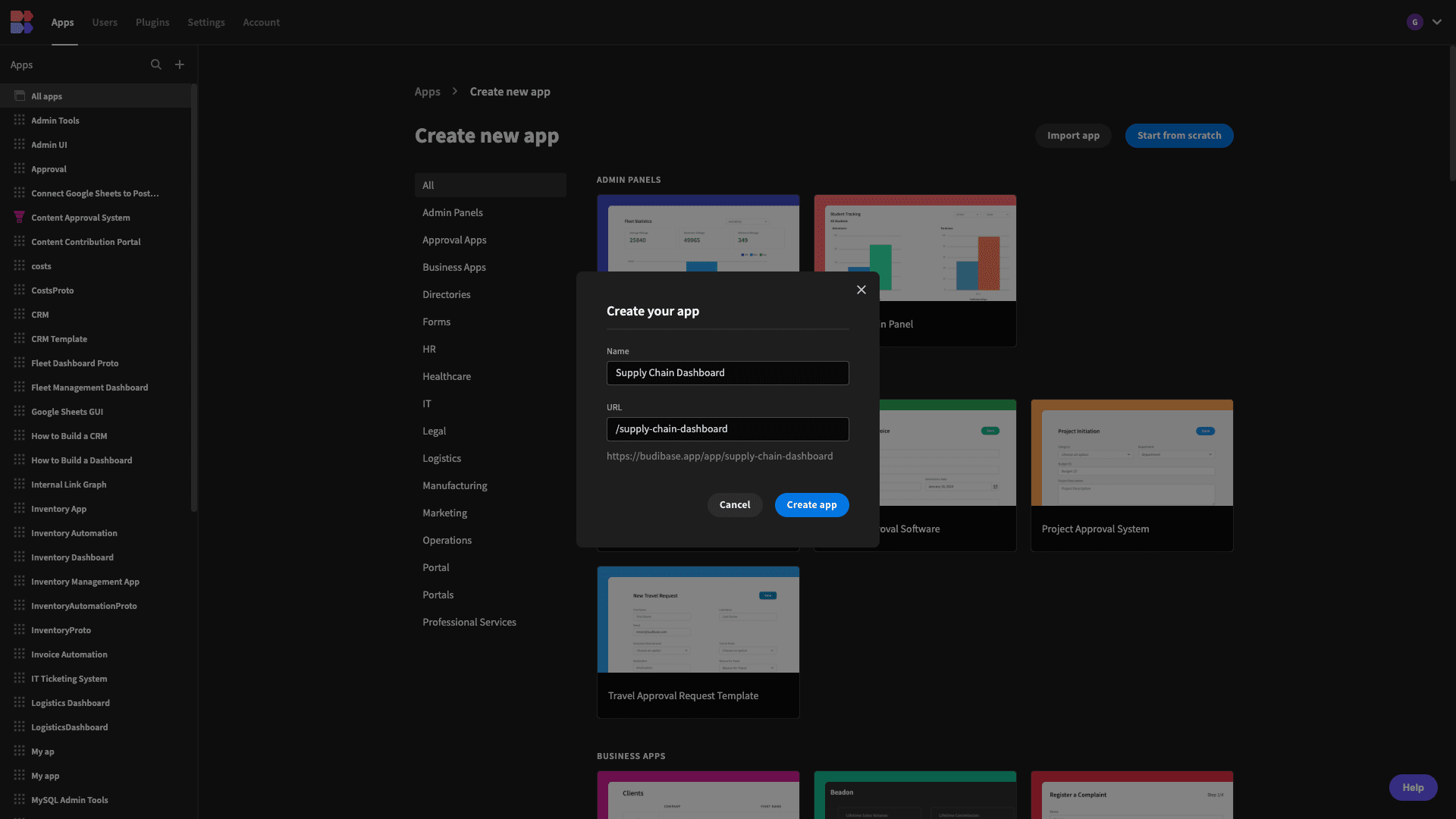
The first thing we need to do is create a new Budibase application and give it a name. By default, this will also be used as its URL extension - although we can overwrite this too.
We also have the option of using a template or importing an existing app, but we’re starting from scratch today:
We can then choose our first data source:
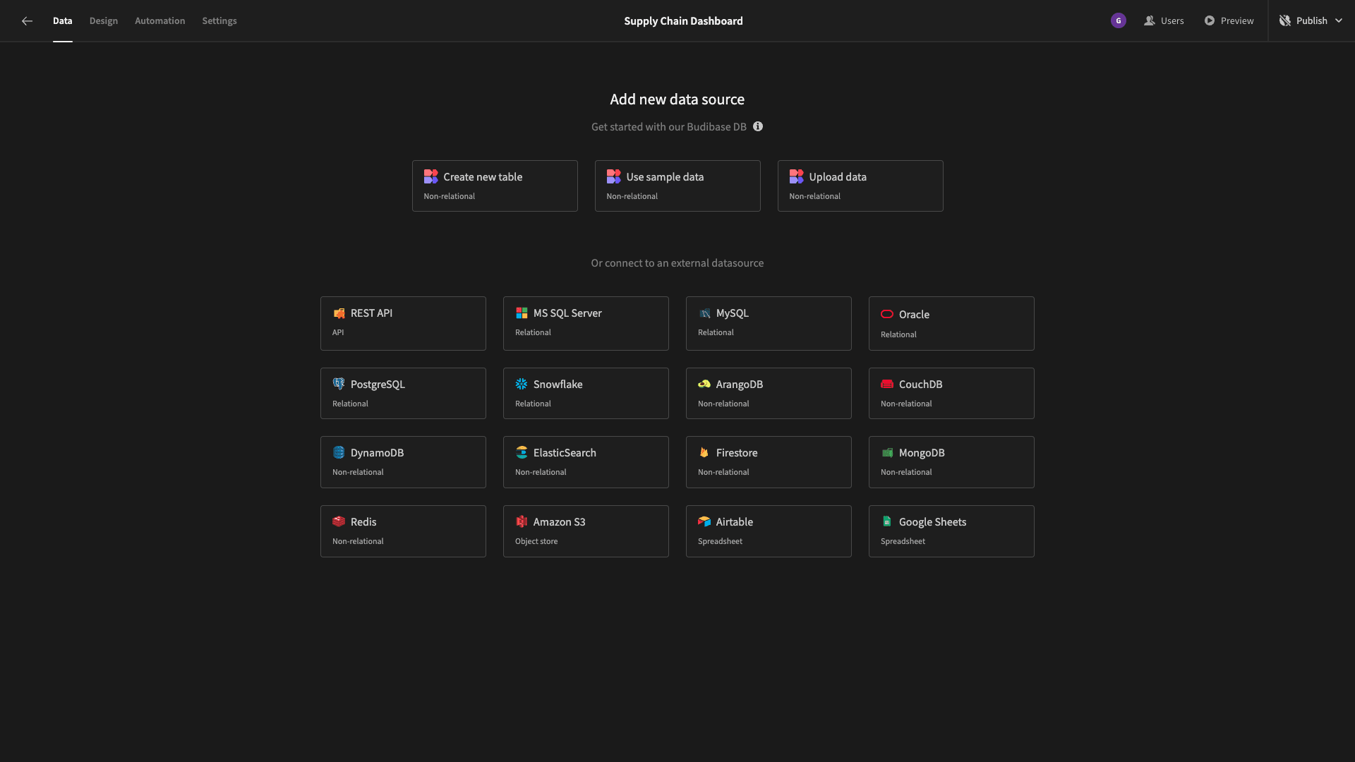
Budibase offers an internal database - if we need a fast, easy way to build our data model. We can also connect to a market-leading range of SQL and NoSQL databases, as well as REST, Google Sheets, and more.
As we say, we’re going to choose Postgres.
We’ll then be prompted to add our configuration details:
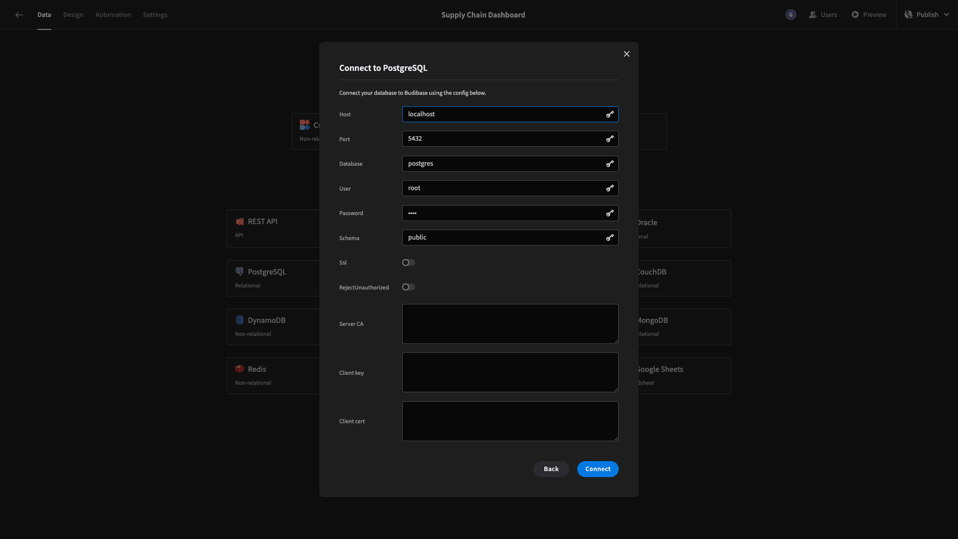
And then, we can choose which tables we want to fetch so that we can manipulate them from within Budibase.
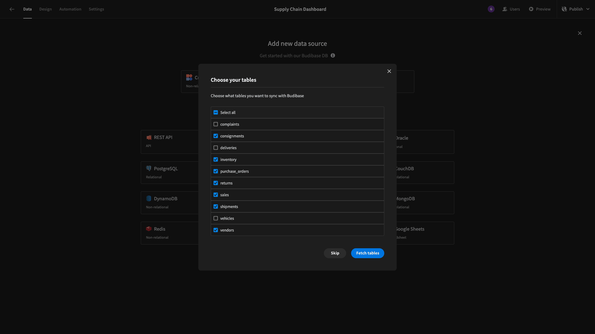
We have the option of pulling in all of the tables within our database - but we have some that we don’t need for our supply chain dashboard, so we’ve just selected the tables we listed earlier.
Straight away, we can perform CRUD operations or alter the schema of our tables within the data section of Budibase:
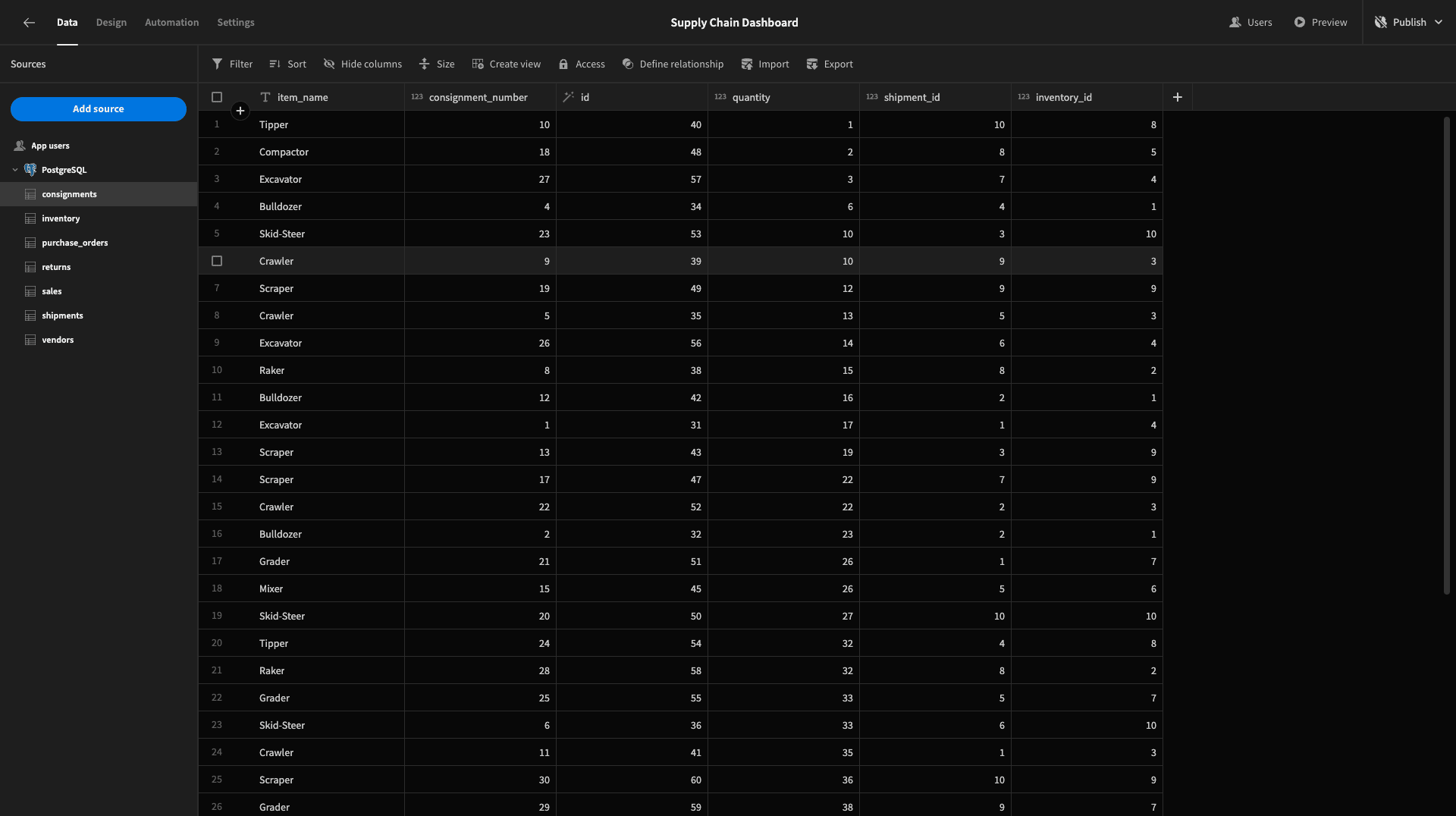
A quick note to explain each of the tables within our data model:
- inventory stores the current state of our stock levels for various items. Including the quantity, price, and vendor_id.
- purchase_orders stores the cost, issue_date, complete_date, and po_number of our purchase orders from vendors.
- sales contains attributes called item_name, quantity, date, id, and inventory_id.
- returns stores request_date, complete_date, reason, id, and the sale_id for the relevant original sale.
- shipments contains a purchase_date, arrive_date, shipment_number, vendor_id, and purchase_order_id.
- vendors stores full details of each of our vendors, including their unique v_id, category, company_name, on other relevant information.
What’s important to take away from this is that different attributes about related entities are stored across our tables. So, we’re going to need to use custom queries to extract the data we need for our supply chain dashboard.
2. Adding our summary cards
With our data imported, we can start building some UIs. We’ll add a blank screen and place a headline component on it:
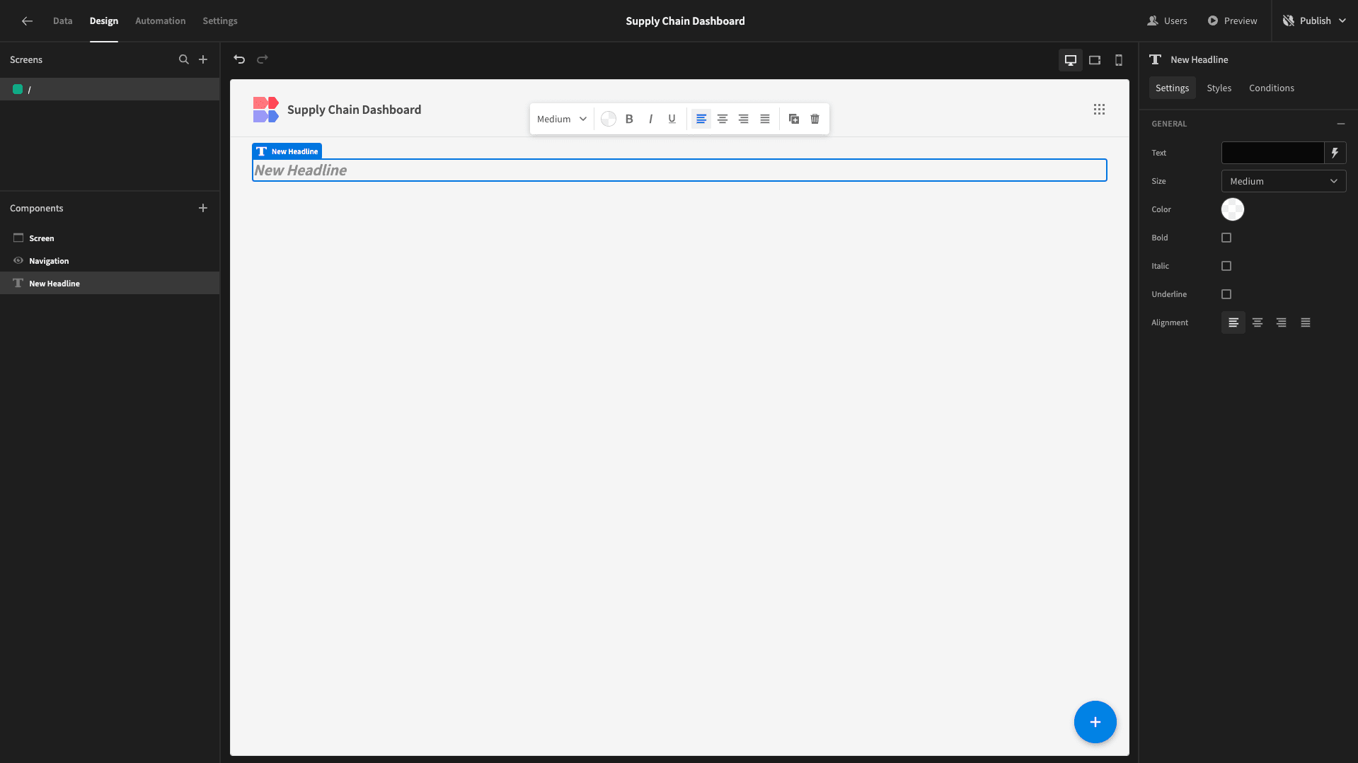
We want this to read This Month: followed by the current month in the format MM/YYYY. To achieve this dynamically, we can use handlebars by opening the bindings drawer using the lightening bolt next to the text field:
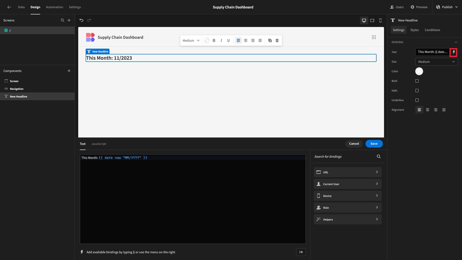
The specific handlebars expression we’re using is:
1This Month: {{ date now "MM/YYYY" }}Below our headline, we’re going to display our row of cards. We’ll add a container and set its direction to horizontal:
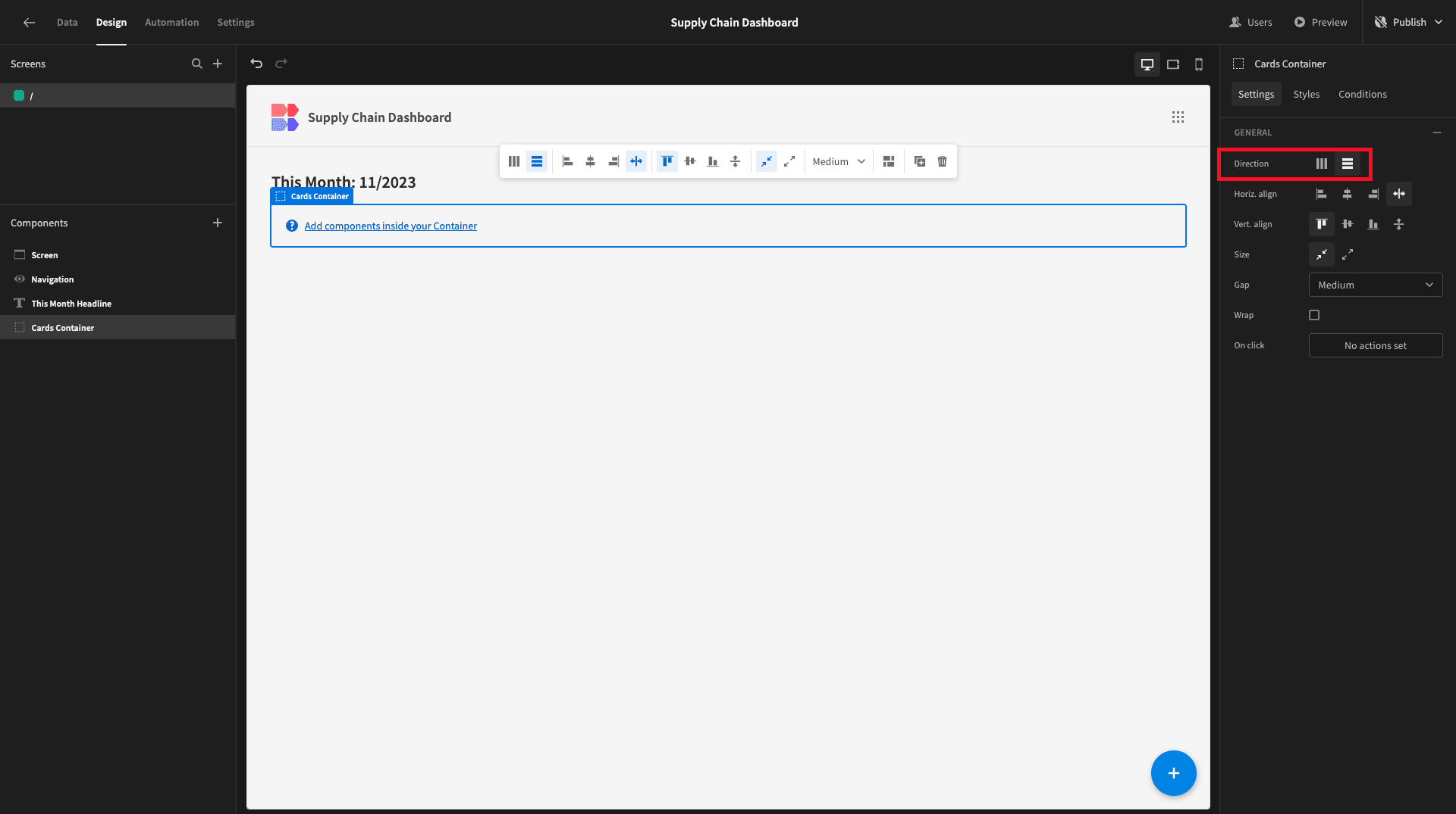
Within this, we’ll add a cards block.
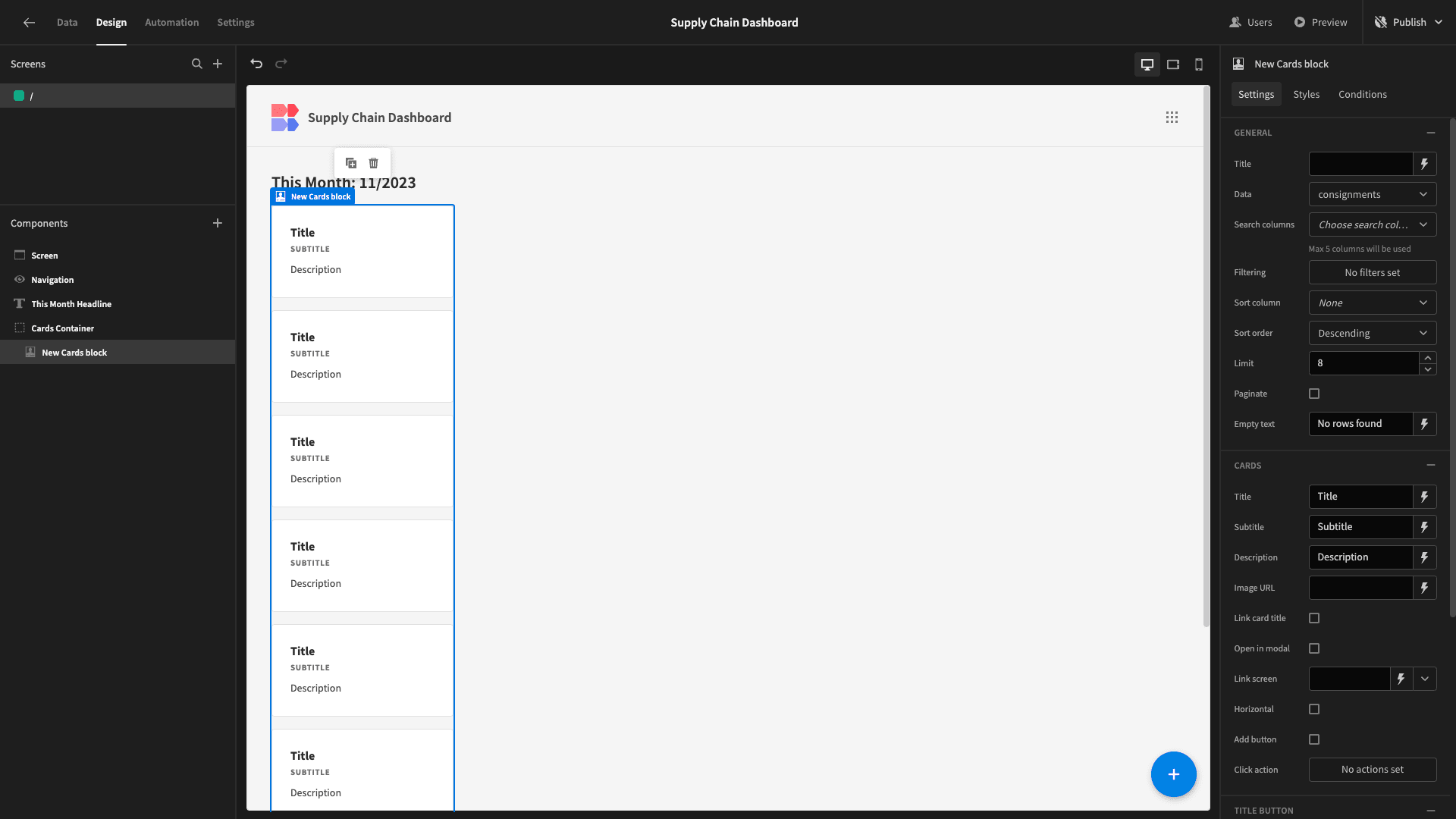
This is a prebuilt set of components that will iterate over whatever data source we point it at and display configurable attributes for each entry.
By the time we’re finished, we’ll have three single cards, showing the current month’s:
- Average purchase order spend.
- Total purchase order spend.
- Number of of purchase orders.
To achieve this, we’ll need a custom query. Head to your Postgres data source, and choose create new query:
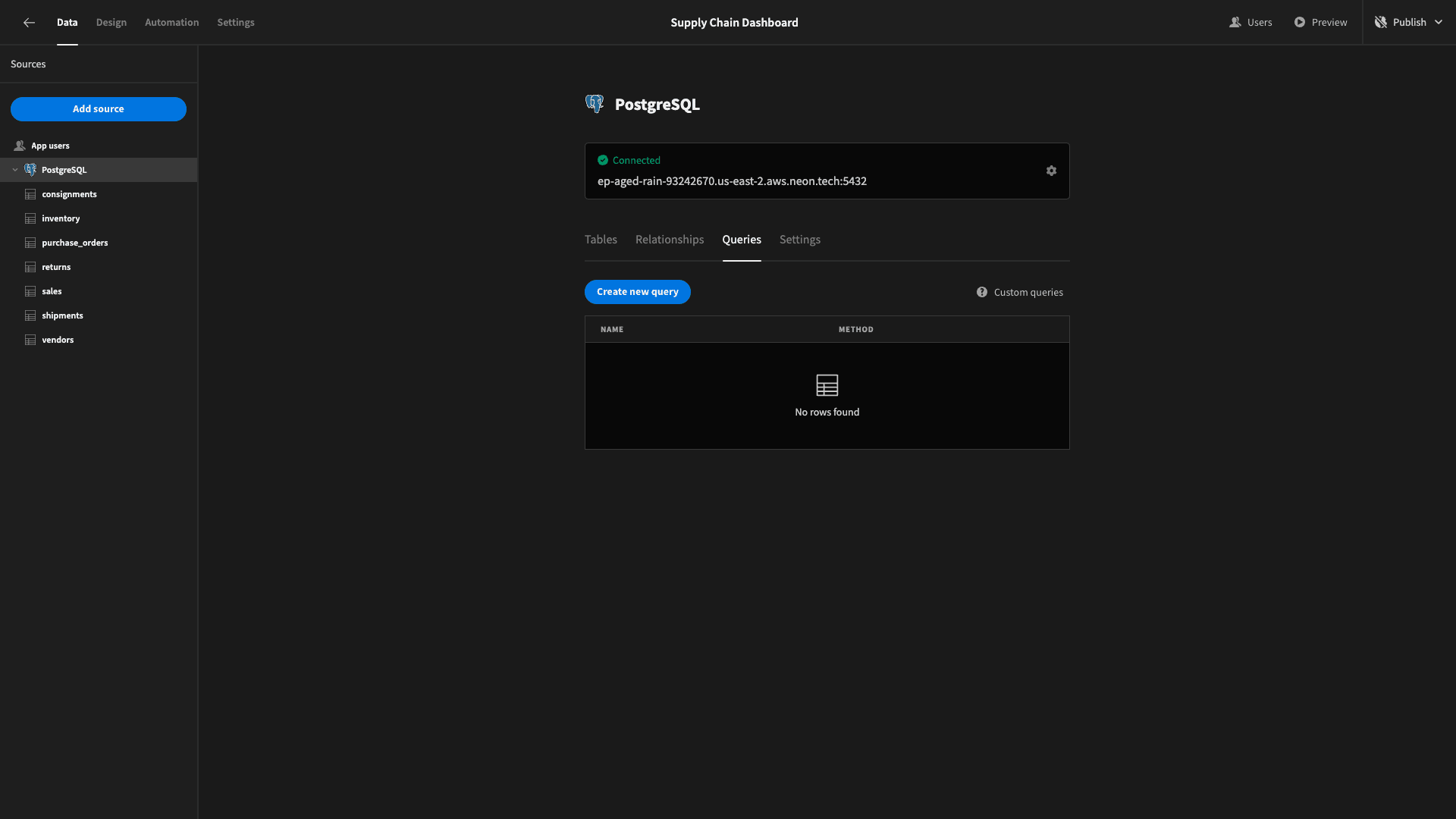
On this screen, we can name our query, write our SQL syntax, configure bindable values, or write JavaScript to transform the response data.
We’re going to call our query CostStatsByMonth:
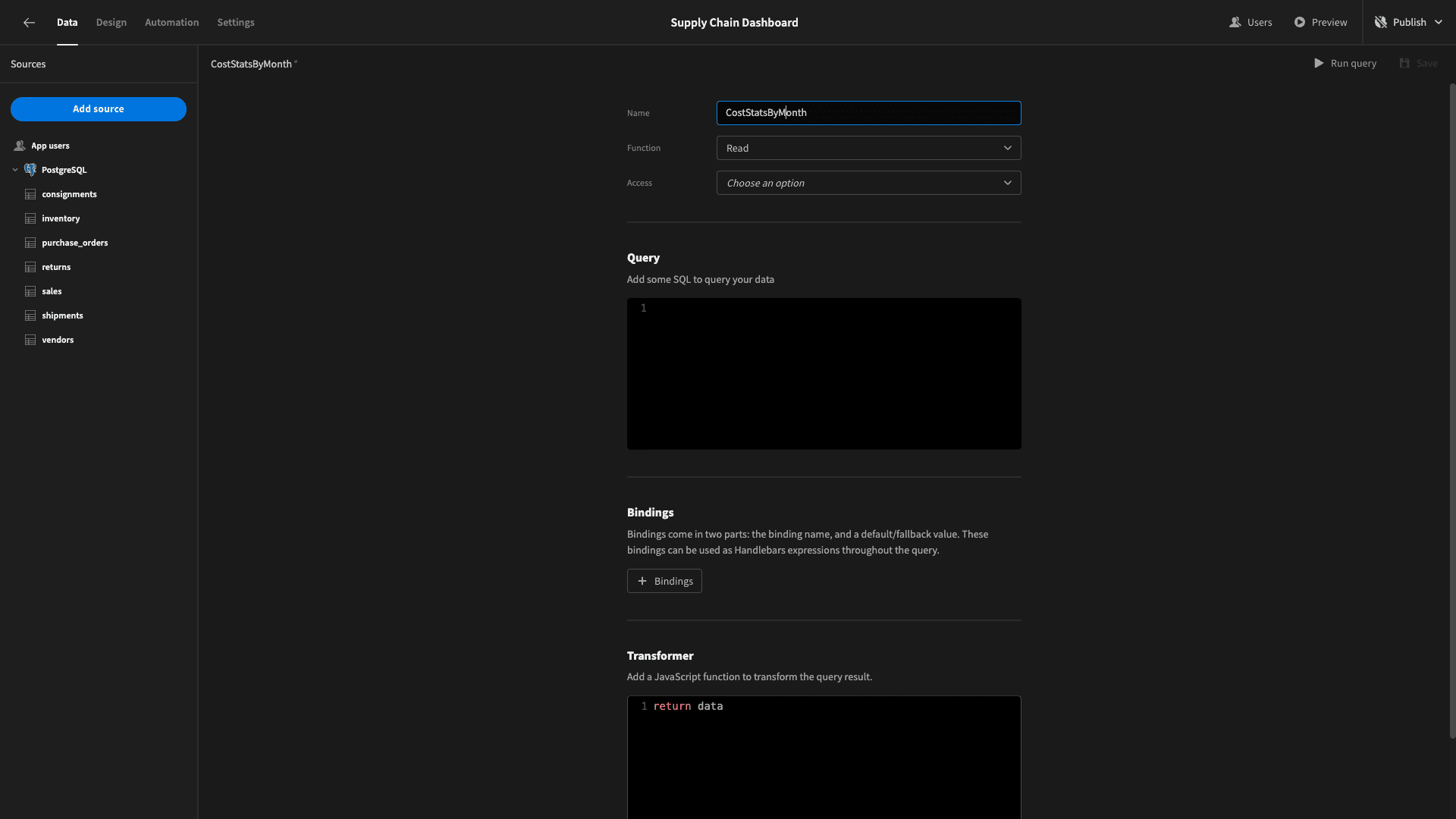
We need to SELECT the following data from our purchase_orders table:
- The numerical month and year, extracted from issue_date and cast as integers.
- The SUM of cost.
- The AVERAGE of cost.
- The COUNT of rows.
We’ll then order and group these by year and month.
So, our query will be:
1SELECT
2
3 EXTRACT(YEAR FROM po.issue_date)::INTEGER AS year,
4
5 EXTRACT(MONTH FROM po.issue_date)::INTEGER AS month,
6
7 SUM(po.cost) AS total_cost,
8
9 AVG(po.cost) AS avg_cost,
10
11 COUNT(*)::INTEGER AS po_count
12
13FROM purchase_orders po
14
15GROUP BY year, month
16
17ORDER BY year, month;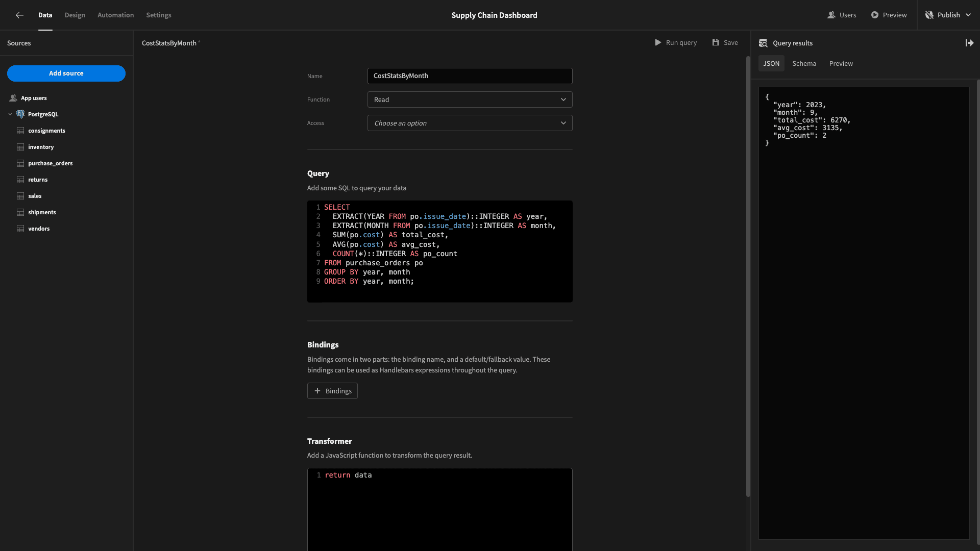
The response object looks like this:
 1{
 2
 3 "year": 2023,
 4
 5 "month": 9,
 6
 7 "total_cost": 6270,
 8
 9 "avg_cost": 3135,
10
11 "po_count": 2
12
13}
Now, head back to the design tab and point your cards block at this new query, under its data field:
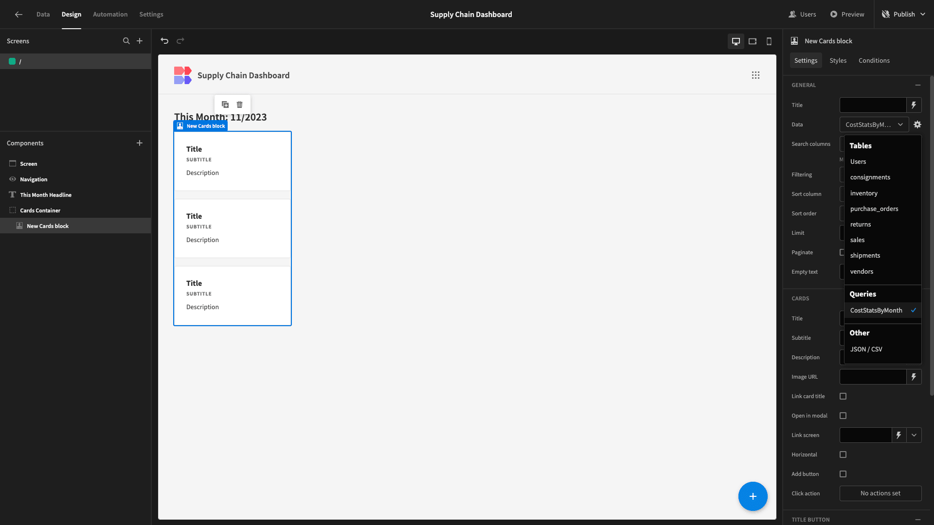
Note that now we have three cards, because we have three months of dummy data. We’ll rename our cards block to Average Cards block.
For this cards block we want the title field to display the query response for the average cost. We’ll use the binding:
1${{ round Average Cards block.CostStatsByMonth.avg_cost }}We’ve placed a dollar sign in front of the value and used the round helper to display the average cost as an integer:
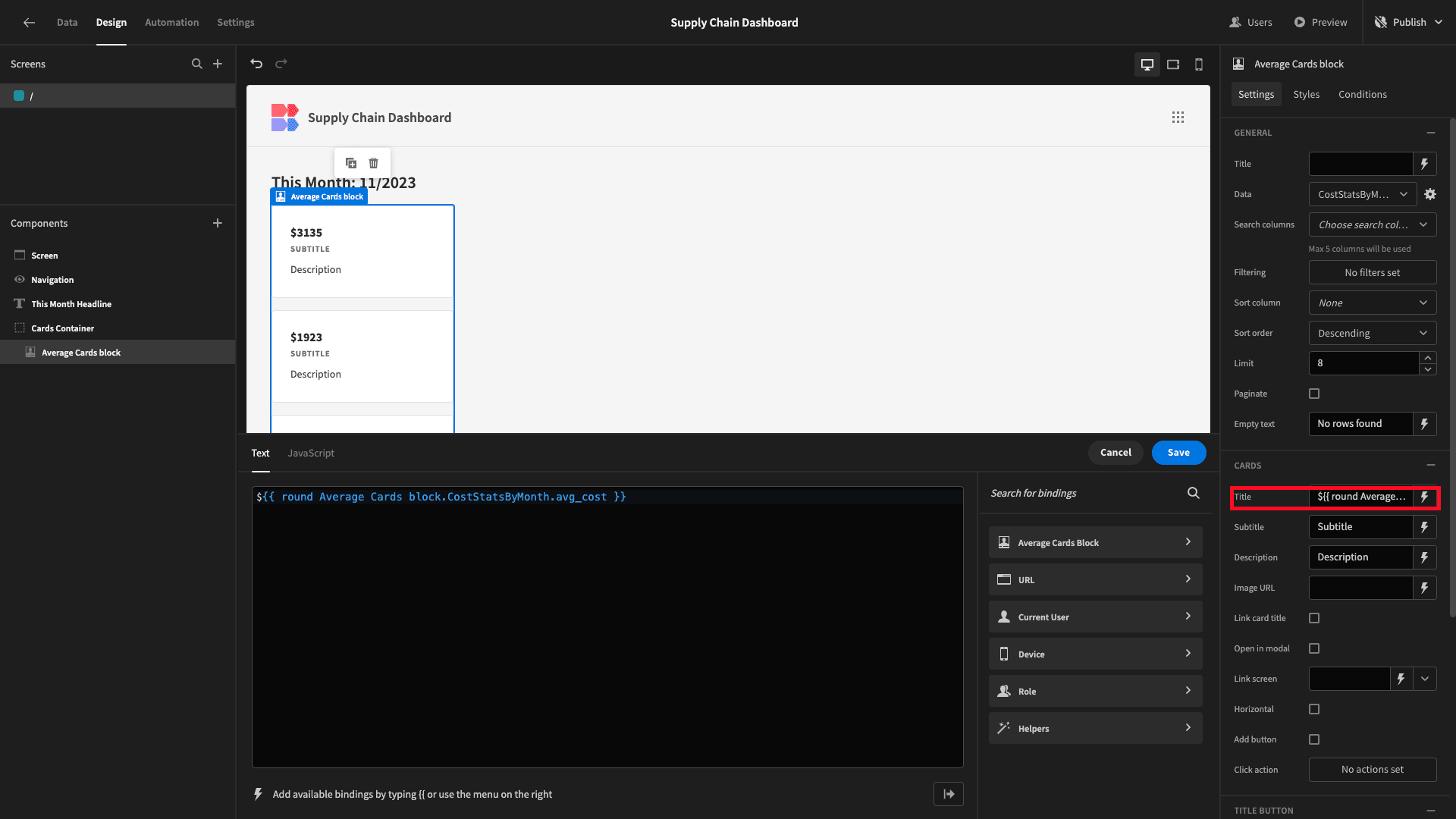
We’ll also give our cards a descriptive subtitle and remove the description entirely.
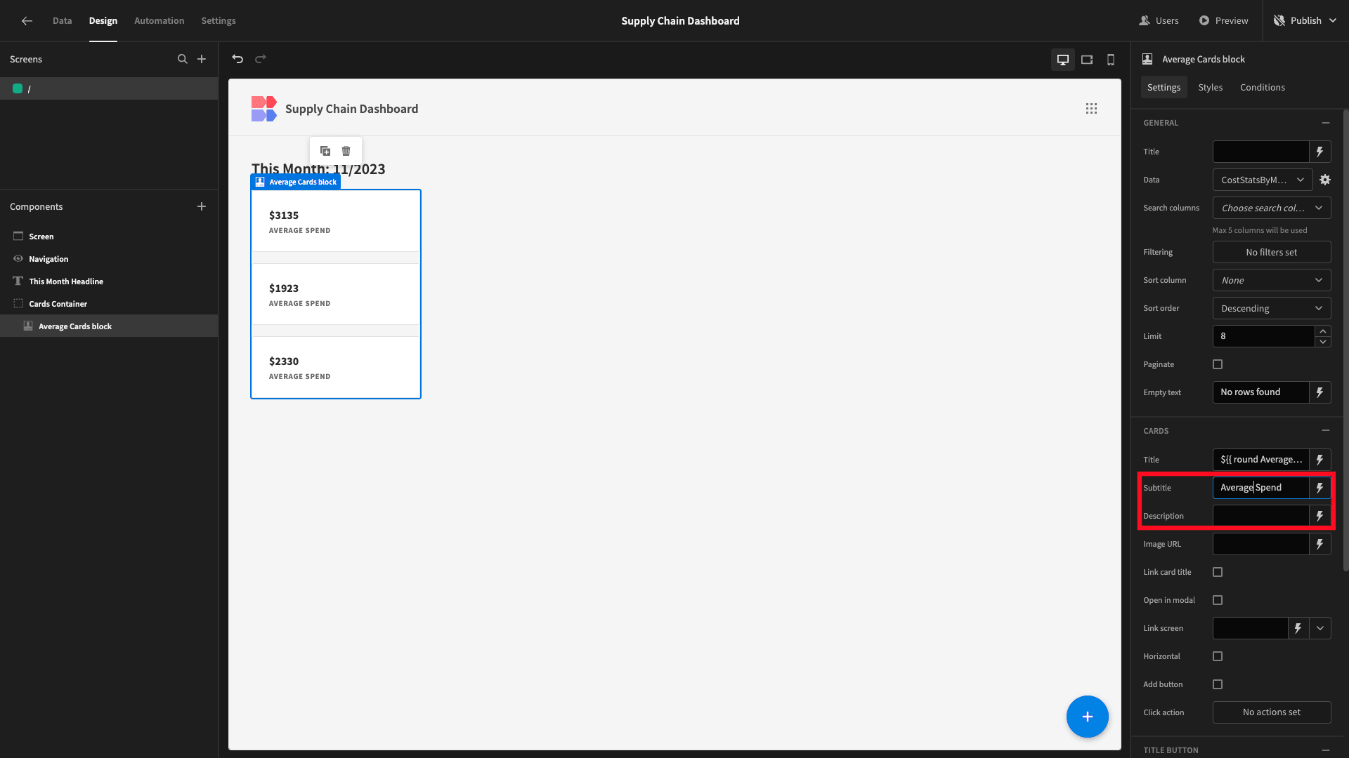
Now, we’re displaying the right data, but we only want this for the current month. We can achieve this with filters.
We’ll open the filters drawer and add two expressions based on the year and month attributes of the response data.
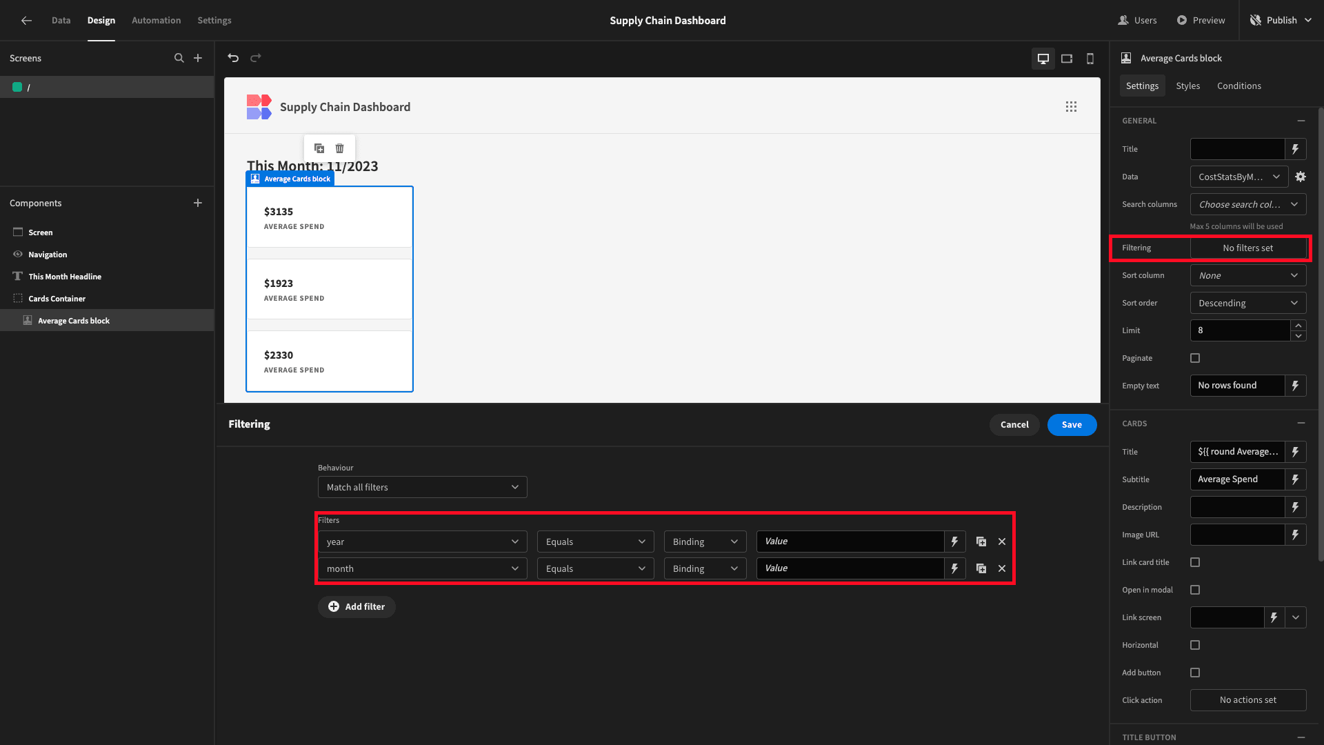
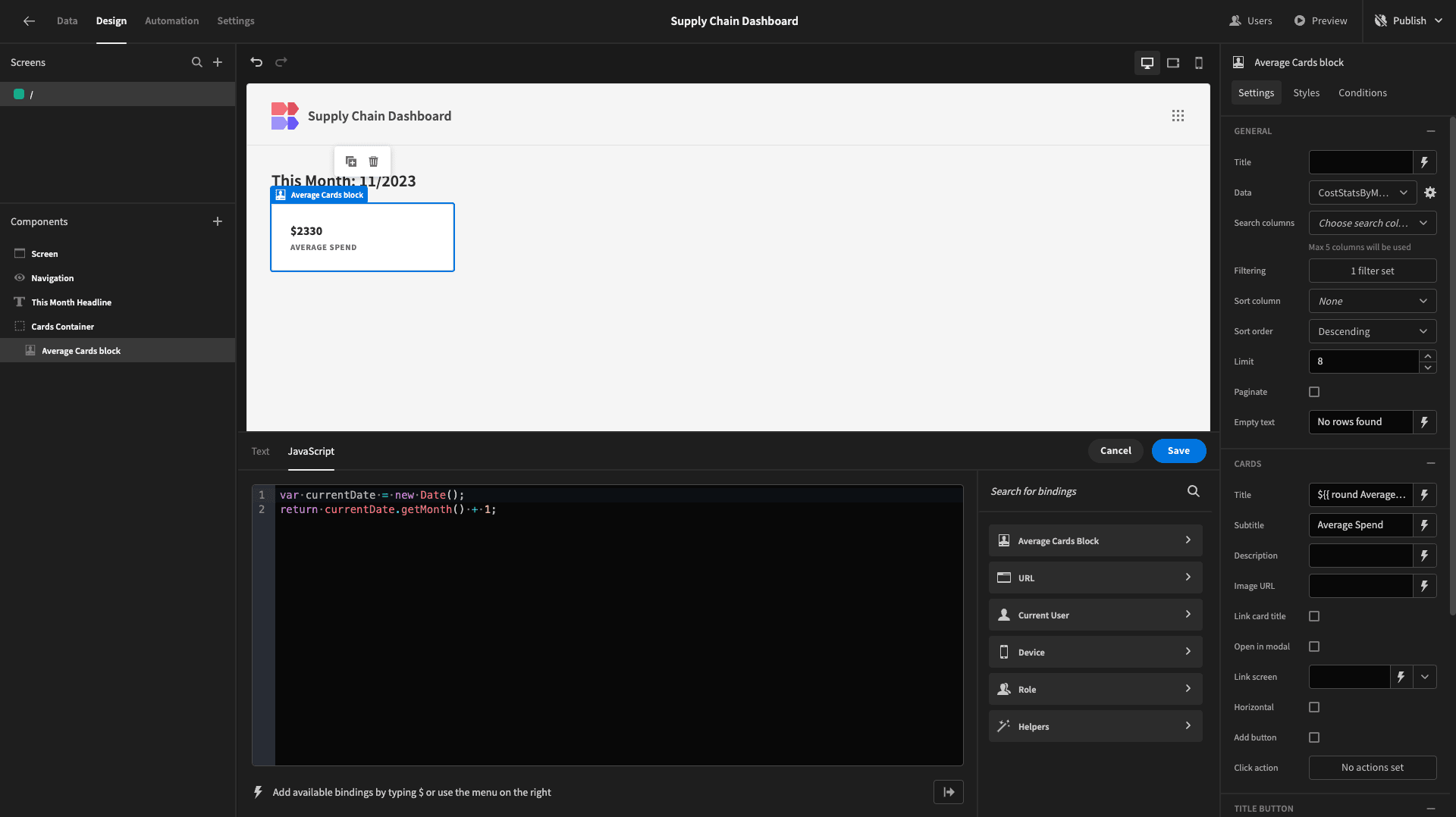
This time, instead of using handlebars, we’ll write a little bit of JavaScript for our bindings.
So we’re filtering the month to equal:
1var currentDate = new Date();
2
3return currentDate.getMonth() + 1;
Note that JavaScript uses zero-based counting for months, so we need to add 1 to the output of the .getMonth() function.
For the year, we’re using:
1var currentDate = new Date();
2
3return currentDate.getFullYear();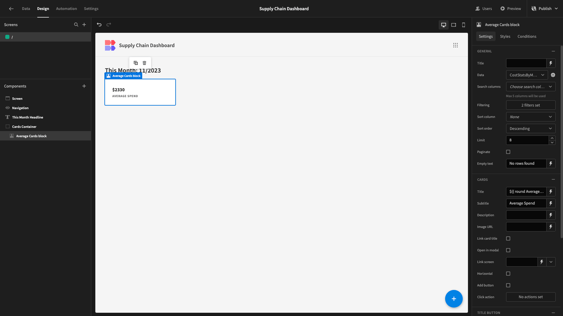
To save ourselves a bit of time, we’ll duplicate this card twice.
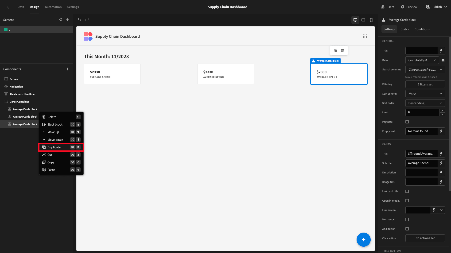
This carried across the filters that we’ve created, so all we need to do is swap out the names, titles, and subtitles to reflect the other two attributes in our query response, giving us:
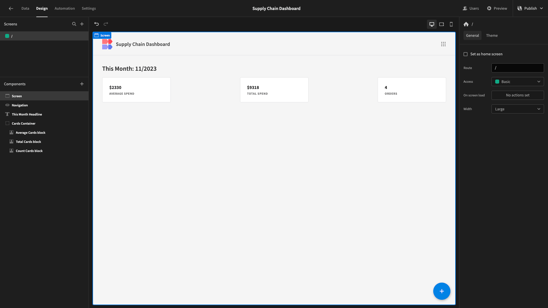
And that’s our cards done.
3. Costs by category and vendor
Below our cards, we want to display two charts. One will be a pie chart which breaks up our costs for the current month by category. The other will be a bar chart that does the same thing by company.
Both of these attributes are stored in our vendors table.
We’ll start by adding another horizontal container.
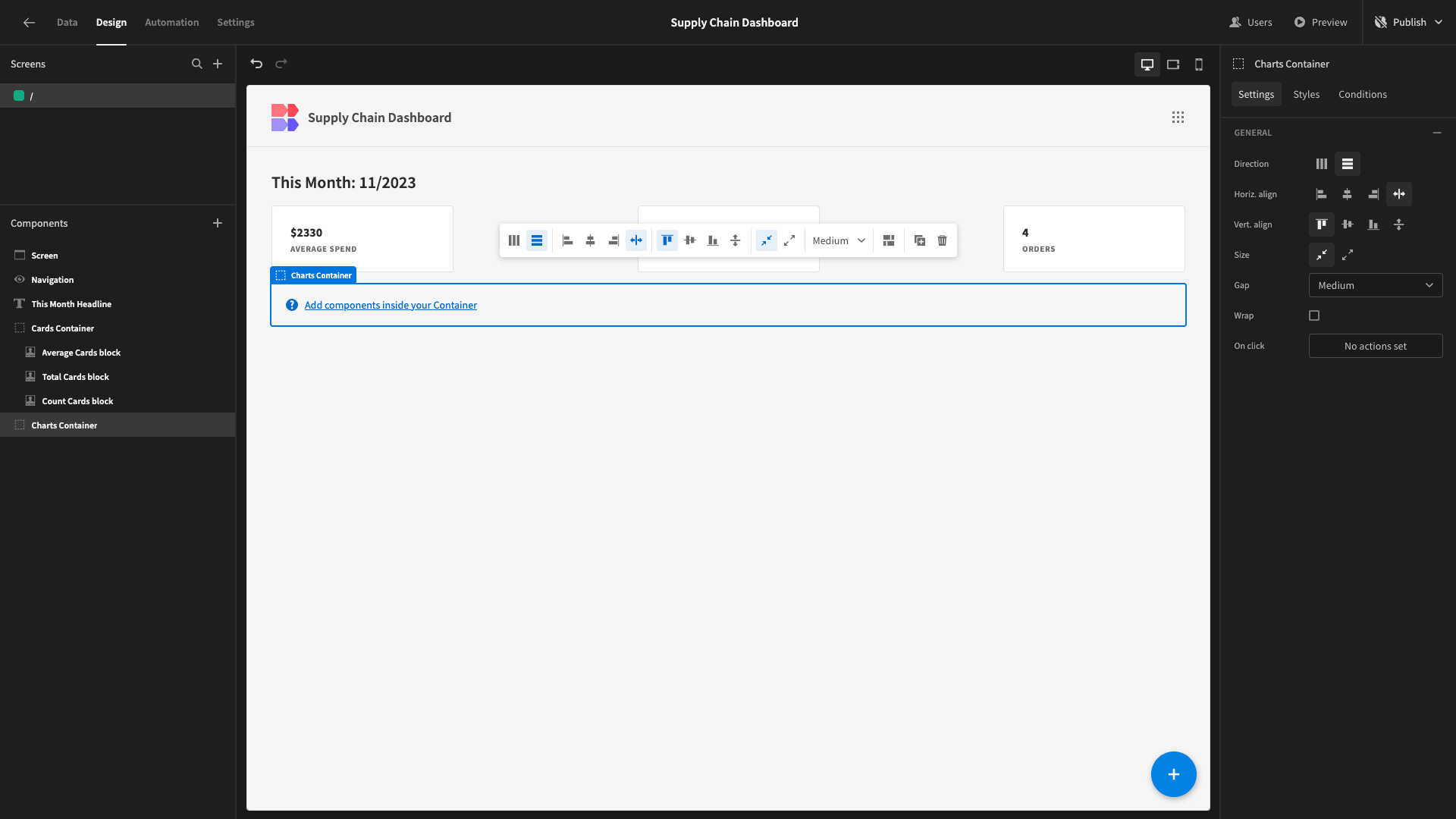
We’ll need a new query for each of these charts. We’ll start by adding a query called CostsByCategory:

We want to SELECT the category from the vendors table and the total cost, month, and year from the purchase_orders table - the same as we did in our last query.
However, purchase_orders and vendors aren’t directly related - but they’re both related to the shipments table.
We’ll need two JOIN statements:
- Between shipments’ purchase_order_id and purchase_orders’ po_number.
- Between shipments’ vendor_id and vendors’ v_id.
We’re also going to GROUP and ORDER BY category, month, and year.
Our query is:
 1SELECT
 2
 3 v.category,
 4
 5 CAST(EXTRACT(YEAR FROM po.issue_date) AS INTEGER) AS year,
 6
 7 CAST(EXTRACT(MONTH FROM po.issue_date) AS INTEGER) AS month,
 8
 9 SUM(po.cost) AS total_cost
10
11FROM purchase_orders po
12
13JOIN shipments s ON po.po_number = s.purchase_order_id
14
15JOIN vendors v ON s.vendor_id = v.v_id
16
17GROUP BY v.category, year, month
18
19ORDER BY v.category, year, month;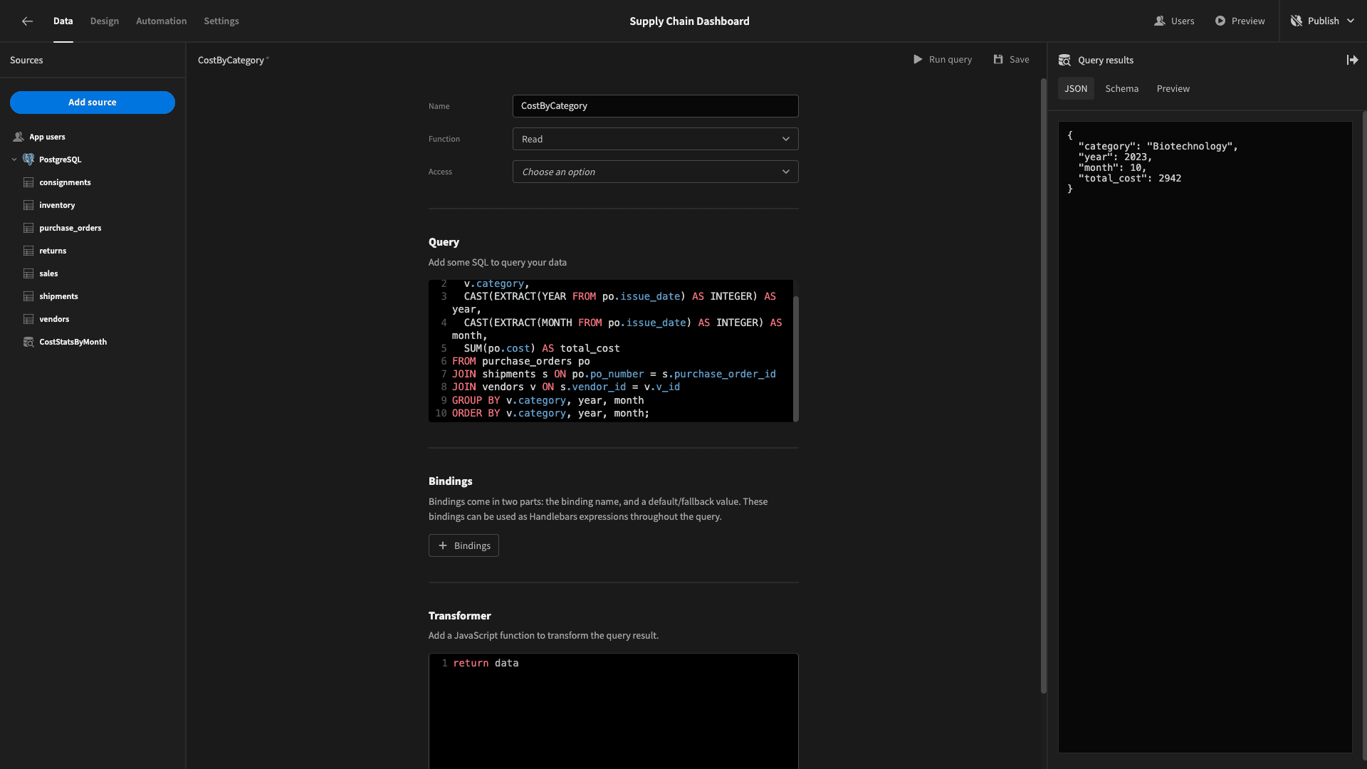
The response schema is:
 1{
 2
 3 "category": "Biotechnology",
 4
 5 "year": 2023,
 6
 7 "month": 10,
 8
 9 "total_cost": 2942
10
11}
Back to design, we’ll add a chart block inside our new container:
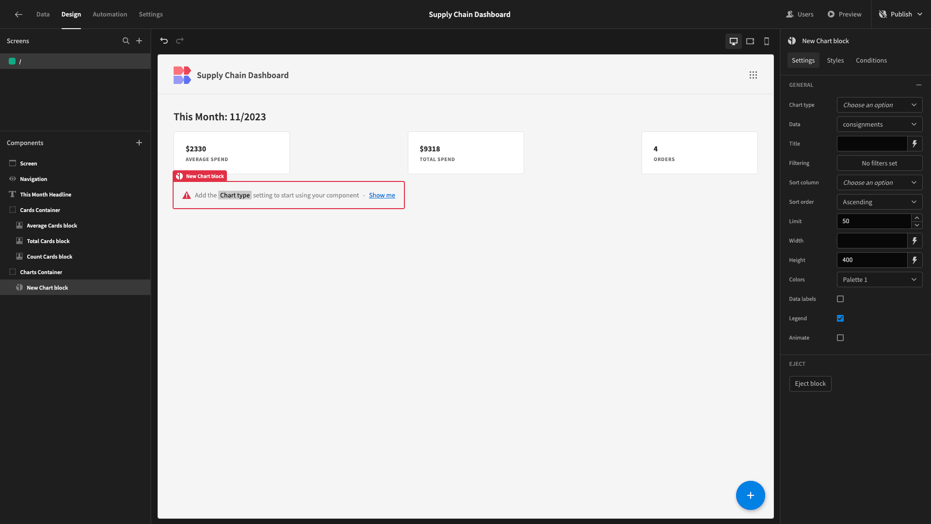
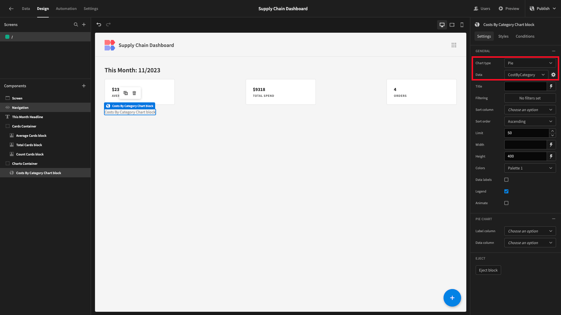
We’ll set chart type to pie and data to our new query:
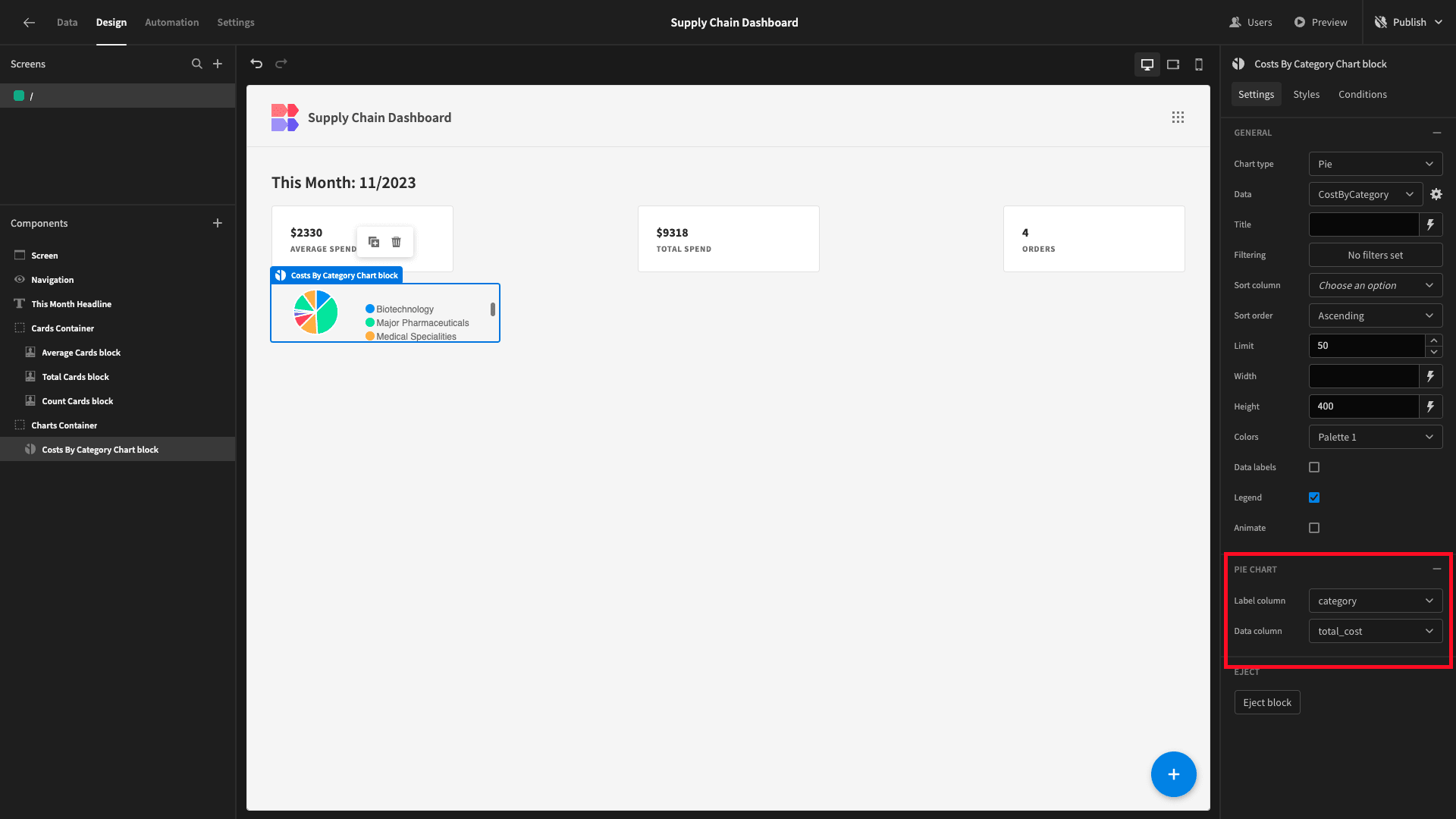
Then, we need to tell our chart which data we want it to display on each axis. We’ll set the label column to category and the data column to total_cost.
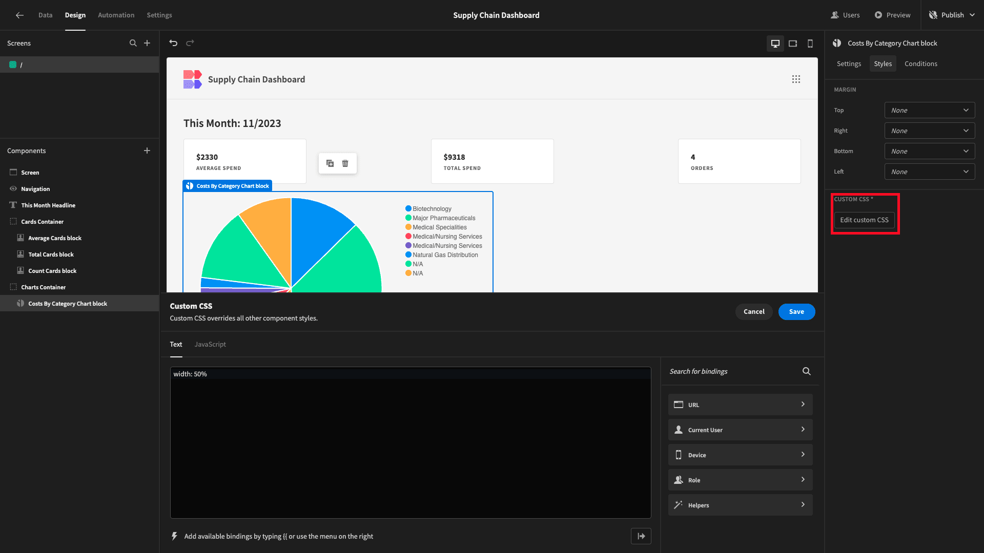
We’ll also add some CSS to set the width to 50%:
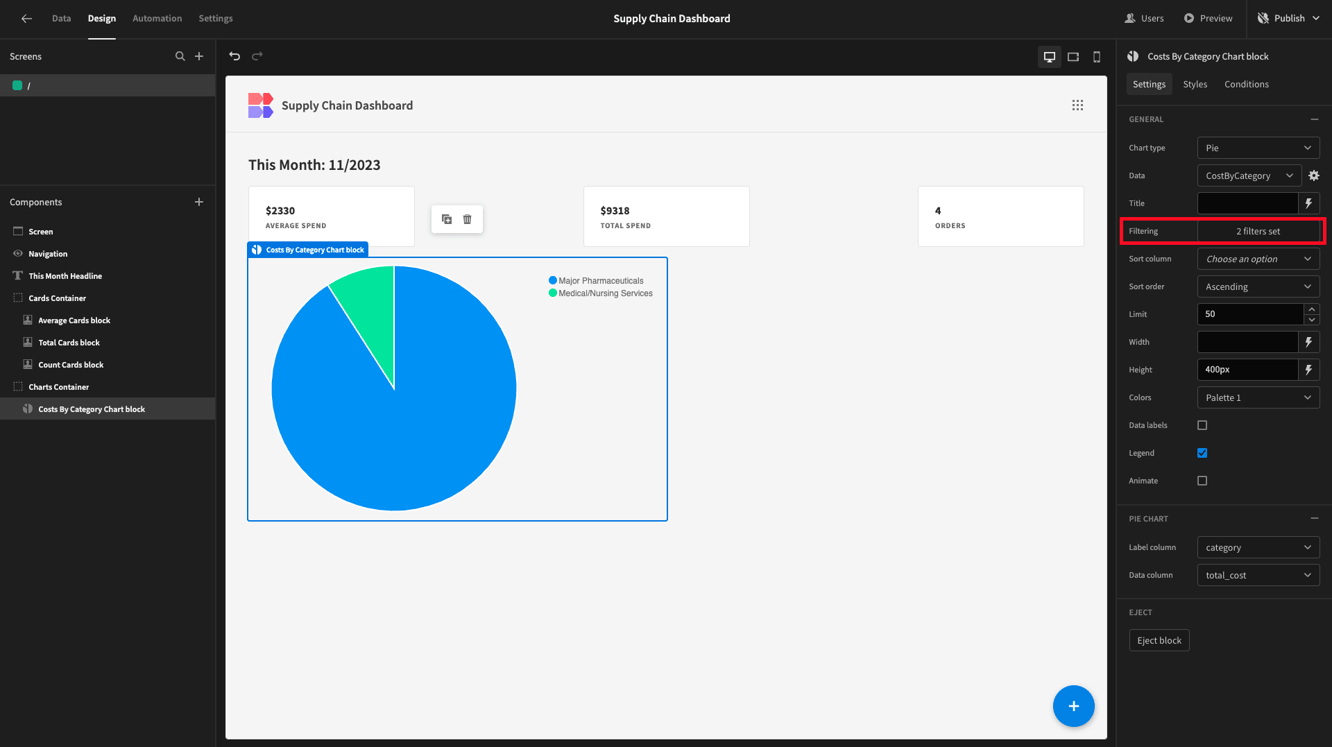
Lastly, we’ll apply the exact same filters as we did to our cards so that our chart only displays the current month’s values:
Beside this, we want a bar chart that displays similar data, broken up by company_name. We’ll add a new query called CostsByCompanyName.
This will work the exact same way as our previous query, just replacing the category with the company_name attribute from our vendors table.
So, our new query is:
 1SELECT
 2
 3 v.company_name,
 4
 5 CAST(EXTRACT(YEAR FROM po.issue_date) AS INTEGER) AS year,
 6
 7 CAST(EXTRACT(MONTH FROM po.issue_date) AS INTEGER) AS month,
 8
 9 SUM(po.cost) AS total_cost
10
11FROM purchase_orders po
12
13JOIN shipments s ON po.po_number = s.purchase_order_id
14
15JOIN vendors v ON s.vendor_id = v.v_id
16
17GROUP BY v.company_name, year, month
18
19ORDER BY v.company_name, year, month;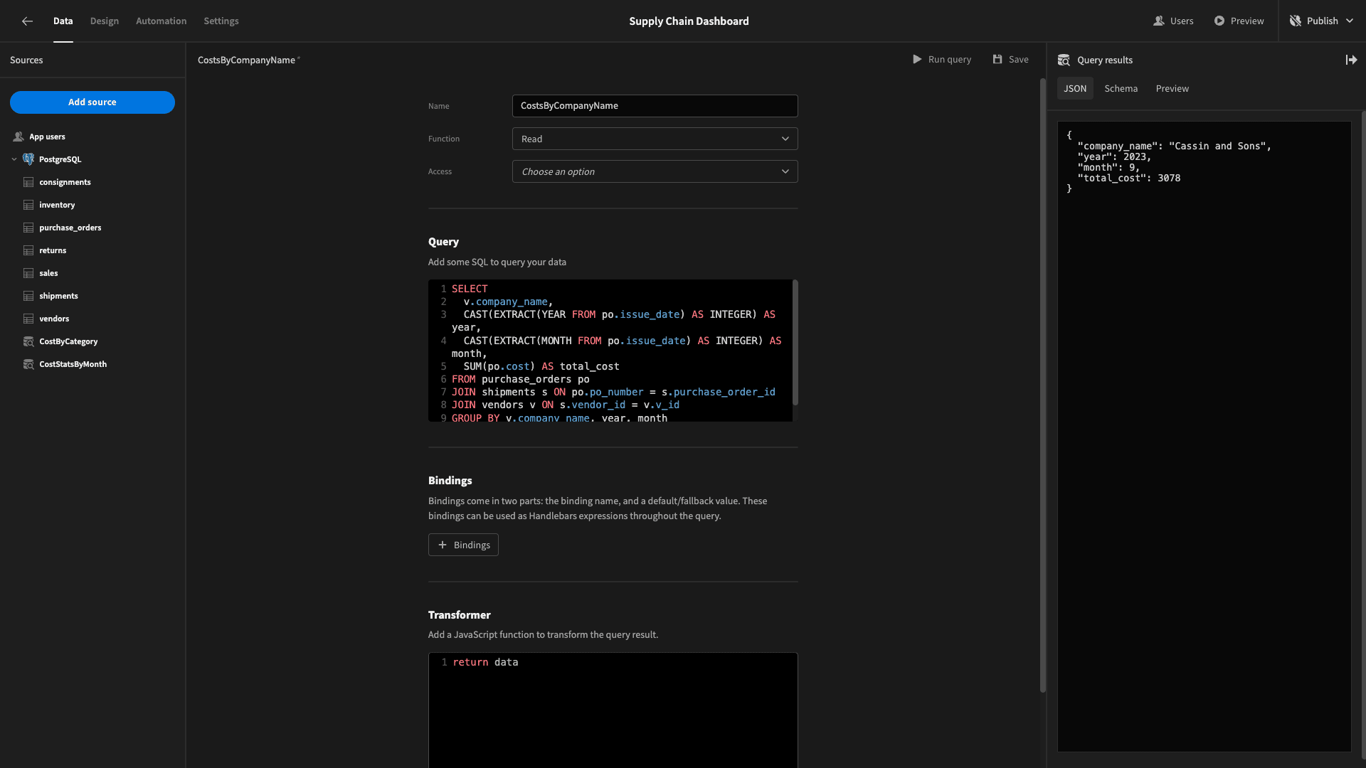
This returns:
 1{
 2
 3 "company_name": "Cassin and Sons",
 4
 5 "year": 2023,
 6
 7 "month": 9,
 8
 9 "total_cost": 3078
10
11}
We’ll duplicate our existing chart, rename it, set the type to bar, and point it at this new query:
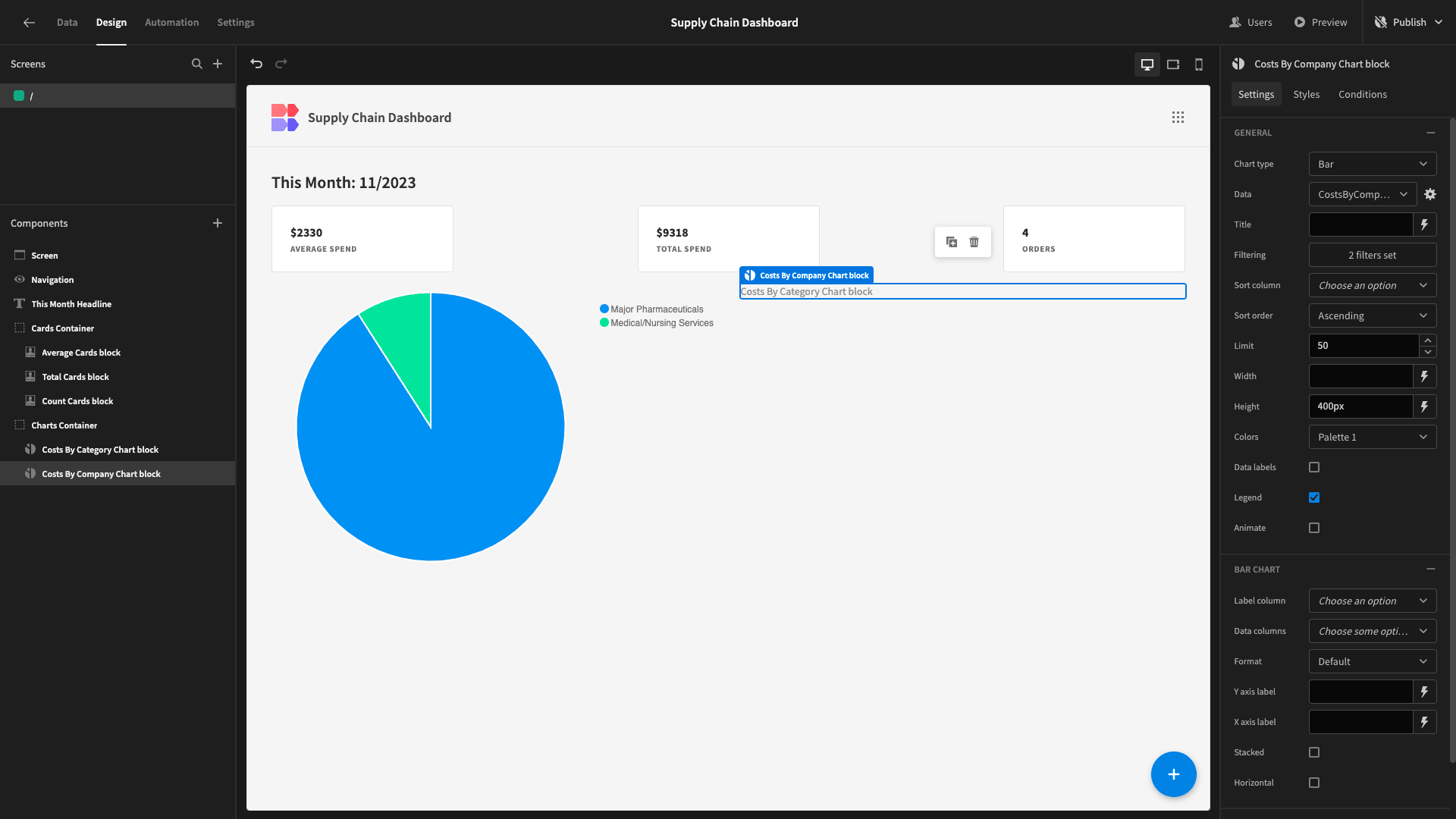
We’ll set the label column to company_name, the data column to total_cost, and tick the horizontal checkbox:
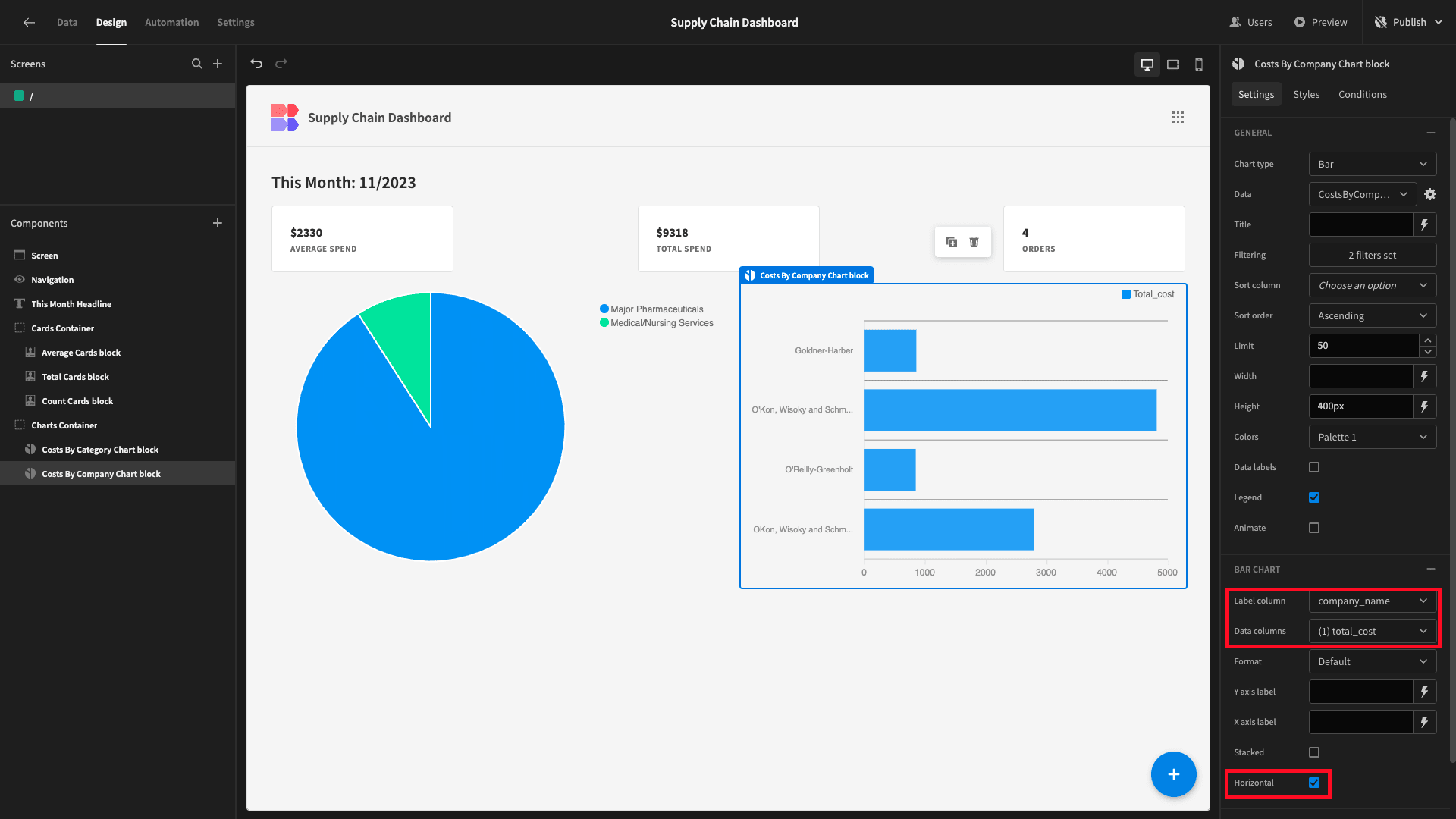
We’ll also give our two charts descriptive titles:
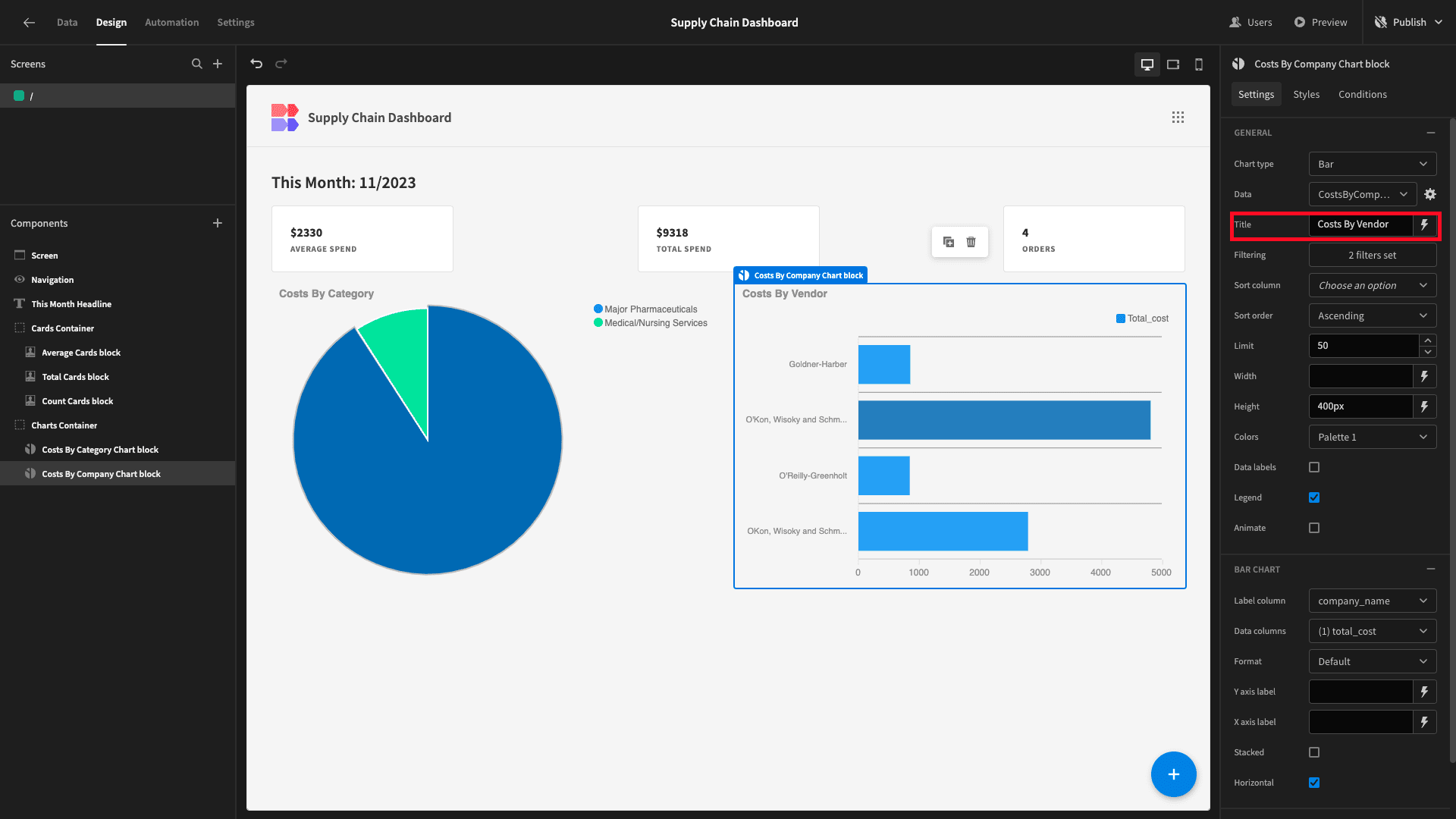
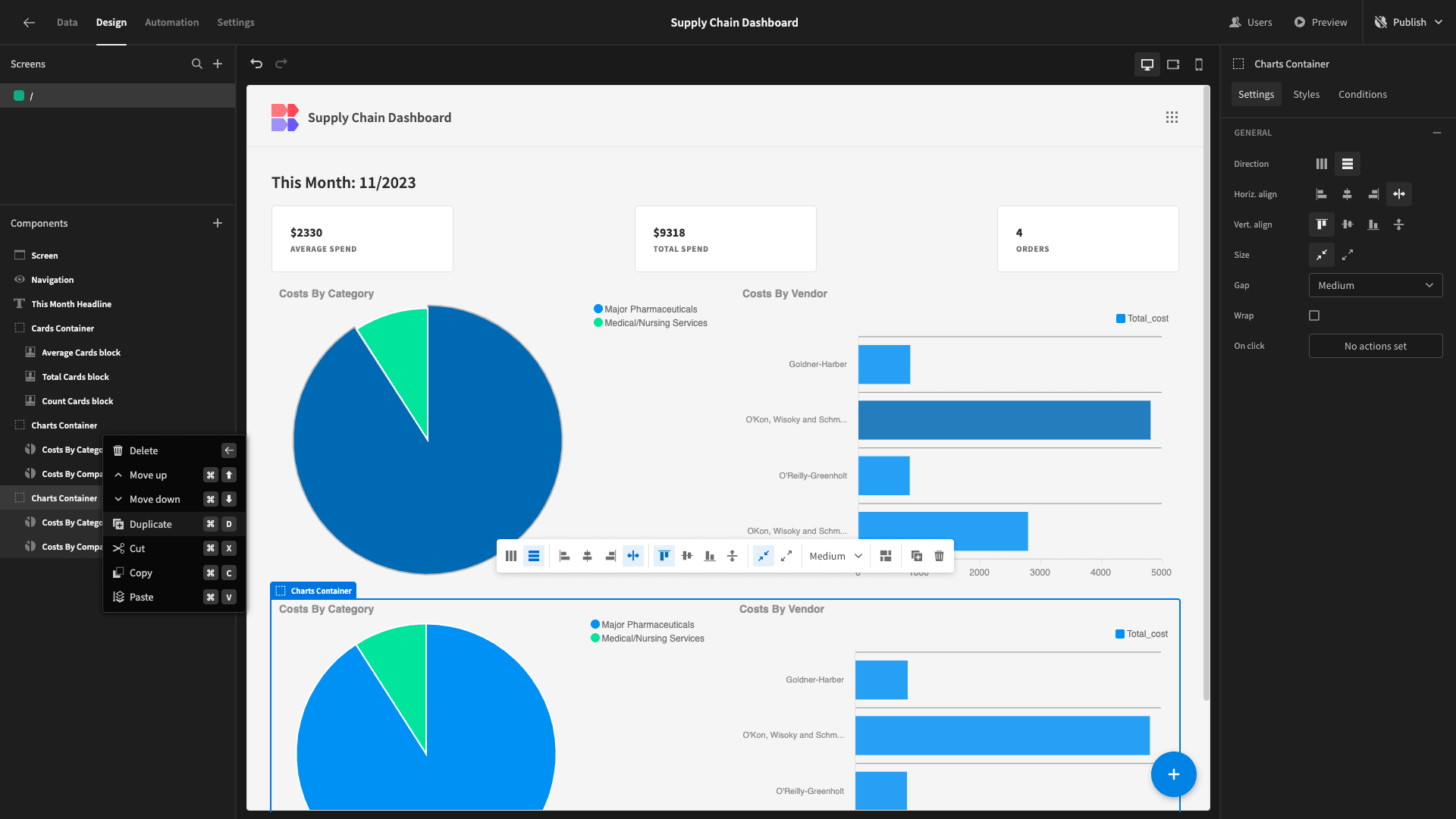
We’re going to create two more charts beneath these ones. To save ourselves configuring our filters again, we’ll simply duplicate their entire parent container:
4. Net stock change by item
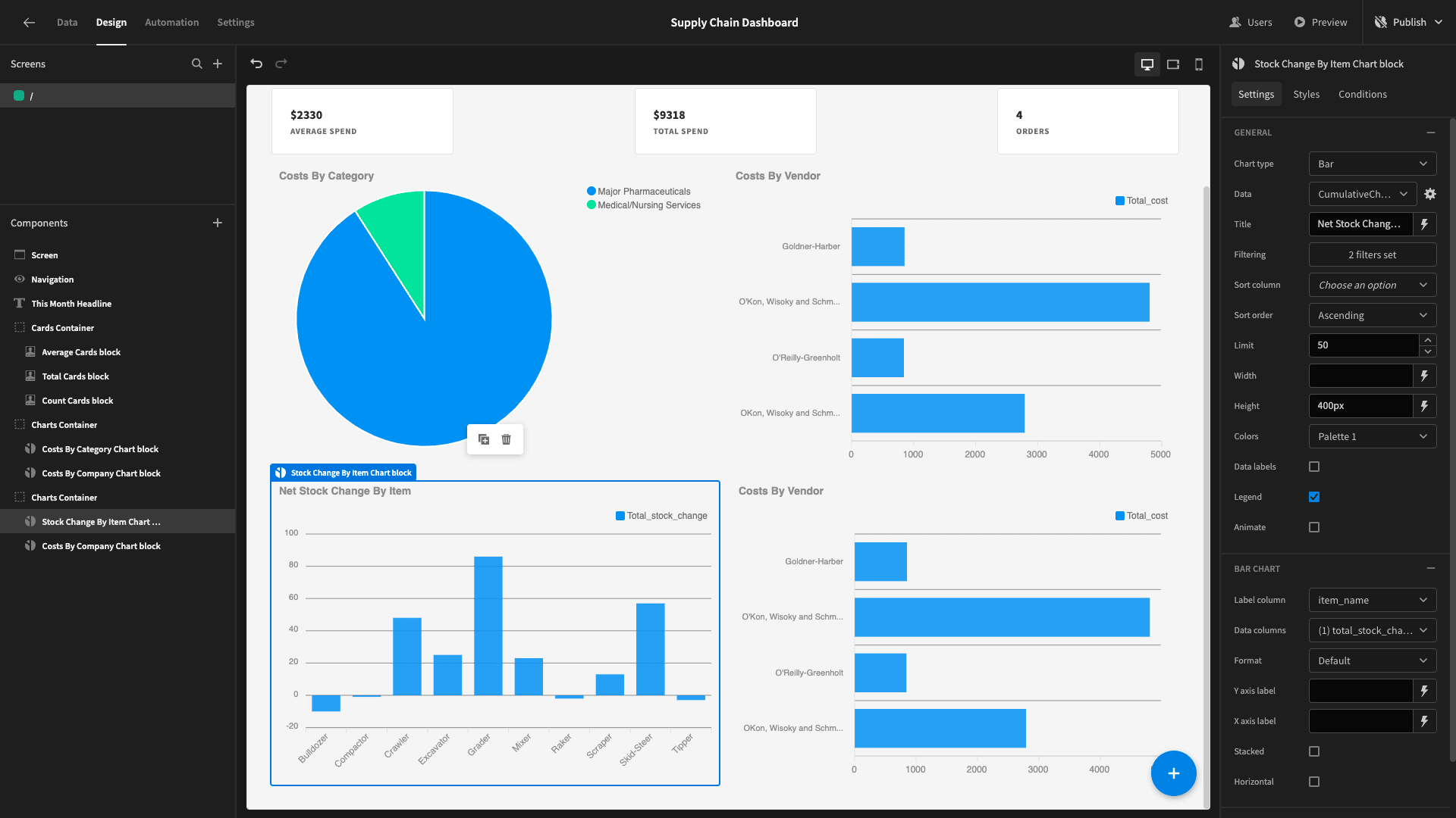
Our third chart is going to be a bar chart displaying the net stock change by item for the current month.
When we make a sale, our stock decreases. When a sale is returned or we receive a new consignment of an item, the stock increases.
This will require a more complex query, involving our shipments, consignments, sales, and returns tables.
We’ll start by using a common table expression with three SELECT statements:
- Retrieves the item_name and SUM of quantities from the consignments table, along with the relevant month and year from the related shipments rows.
- Retrieves the month and year, item_name, and negative SUM of quantities from the sales table.
- Retrieves the month and year from the returns table along with the item_name and SUM of quantities from the original sales entry.
We’ll then aggregate these quantities to calculate the total change, and GROUP BY month, year, and item_name.
We’ll call this query CumulativeChangeByItemByMonth:
1WITH AllStockChanges AS (
2
3 SELECT
4
5 c.item_name,
6
7 DATE_TRUNC('month', s.arrive_date) AS month_year,
8
9 SUM(c.quantity) AS stock_change
10
11 FROM consignments c
12
13 JOIN shipments s ON c.shipment_id = s.shipment_number
14
15 GROUP BY c.item_name, month_year
16
17 UNION ALL
18
19 SELECT
20
21 s.item_name,
22
23 DATE_TRUNC('month', s.date) AS month_year,
24
25 -SUM(s.quantity) AS stock_change
26
27 FROM sales s
28
29 GROUP BY s.item_name, month_year
30
31 UNION ALL
32
33 SELECT
34
35 s.item_name,
36
37 DATE_TRUNC('month', r.complete_date) AS month_year,
38
39 SUM(s.quantity) AS stock_change
40
41 FROM sales s
42
43 JOIN returns r ON s.id = r.sale_id
44
45 GROUP BY s.item_name, month_year
46
47)
48
49SELECT
50
51 item_name,
52
53 EXTRACT(YEAR FROM month_year)::INTEGER AS year,
54
55 EXTRACT(MONTH FROM month_year)::INTEGER AS month,
56
57 SUM(stock_change) AS total_stock_change
58
59FROM AllStockChanges
60
61GROUP BY item_name, year, month
62
63ORDER BY item_name, year, month;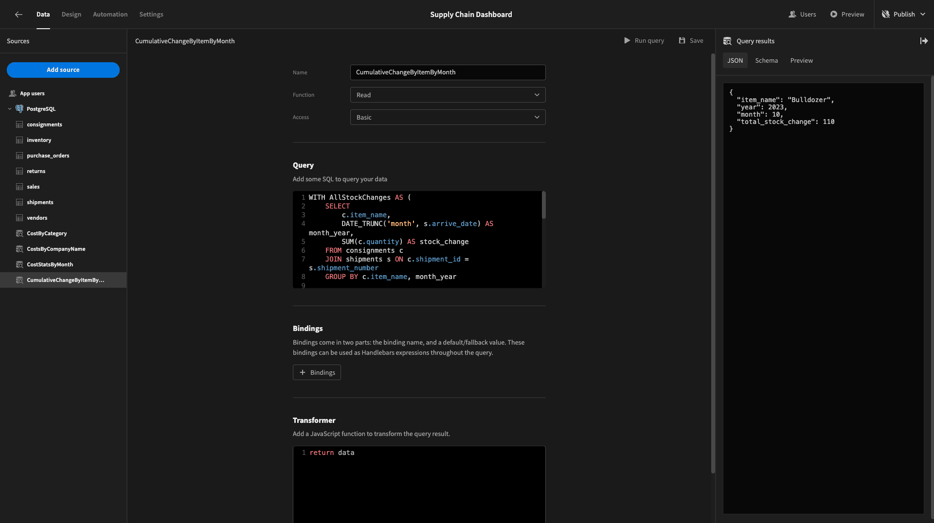
The response will look like this:
 1{
 2
 3 "item_name": "Bulldozer",
 4
 5 "year": 2023,
 6
 7 "month": 10,
 8
 9 "total_stock_change": 110
10
11}
Now, head back to the design tab, and we’ll populate our third chart with the item_name and total_stock_change attributes from this new query, as well as setting its type to bar and editing the title:
5. Cumulative daily spending
Our fourth and final chart will be a line graph displaying our cumulative spending for the month so far.
Once again, we’ll start with a CTE. This will create a date series starting on the first of the current month and ending on the current date. We’ll have on entry per day for the month so far.
In our main query, we’ll SELECT the numerical day, month, and year along with the cumulative sum of the cost attribute from our purchase_orders table corresponding to each of these days.
We’ll also use a COALESCE function so that we return an entry for each date in the series, even if no new costs are added. Finally, we’ll use a LEFT JOIN from our date series to the issue_date colum in our purchase_orders table.
We’ll call this query CumulativeSpendThisMonth:
 1WITH date_series AS (
 2
 3 SELECT
 4
 5  generate_series(
 6
 7   DATE_TRUNC('MONTH', current_date)::DATE,
 8
 9   current_date,
10
11   '1 day'::interval
12
13  ) AS series_date
14
15)
16
17SELECT
18
19 EXTRACT(YEAR FROM ds.series_date)::INTEGER AS year,
20
21 EXTRACT(MONTH FROM ds.series_date)::INTEGER AS month,
22
23 EXTRACT(DAY FROM ds.series_date)::INTEGER AS day,
24
25 COALESCE(SUM(po.cost) OVER (ORDER BY ds.series_date), 0) AS running_daily_cumulative_cost
26
27FROM date_series ds
28
29LEFT JOIN purchase_orders po ON ds.series_date::DATE = po.issue_date::DATE
30
31ORDER BY ds.series_date;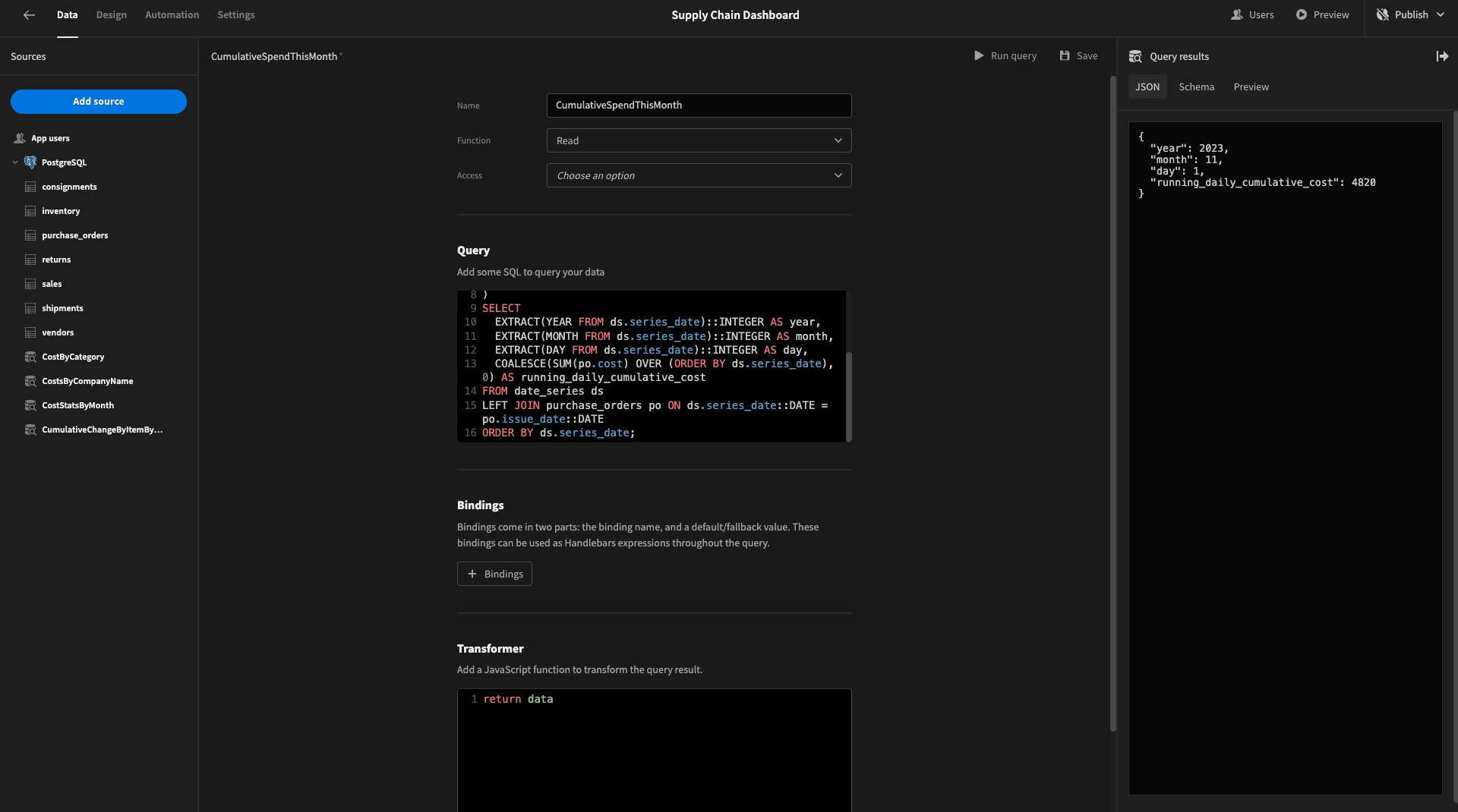
It will return a data object like this:
 1{
 2
 3 "year": 2023,
 4
 5 "month": 11,
 6
 7 "day": 1,
 8
 9 "running_daily_cumulative_cost": 4820
10
11}
To present this on our final chart, we’ll change its type to line, its data to our new query, the label column to day and the data column to running_daily_cumulative_cost. We’ll also set the curve field to straight and update the title:
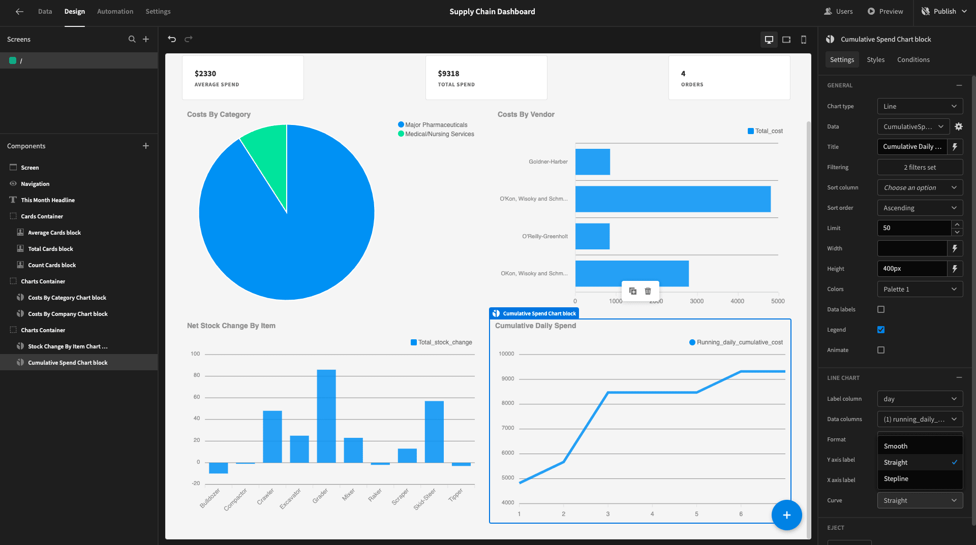
Here’s what we have so far:
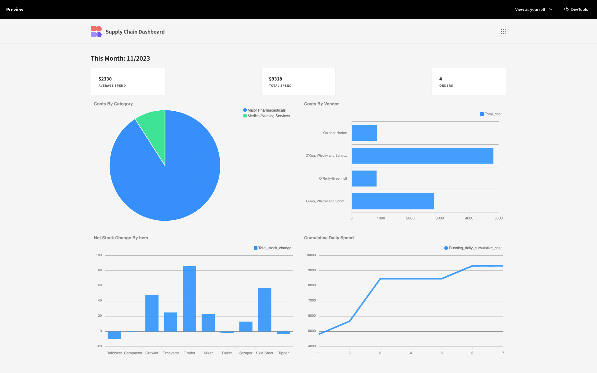
6. Design tweaks and publishing
Now, our supply chain dashboard presents all of the data that we want it to. But - it looks a little drab.
So, we’ll make a few tweaks to brighten things up.
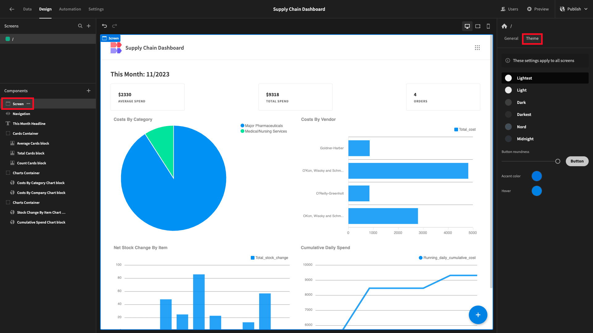
First, we’ll change the theme to lightest:
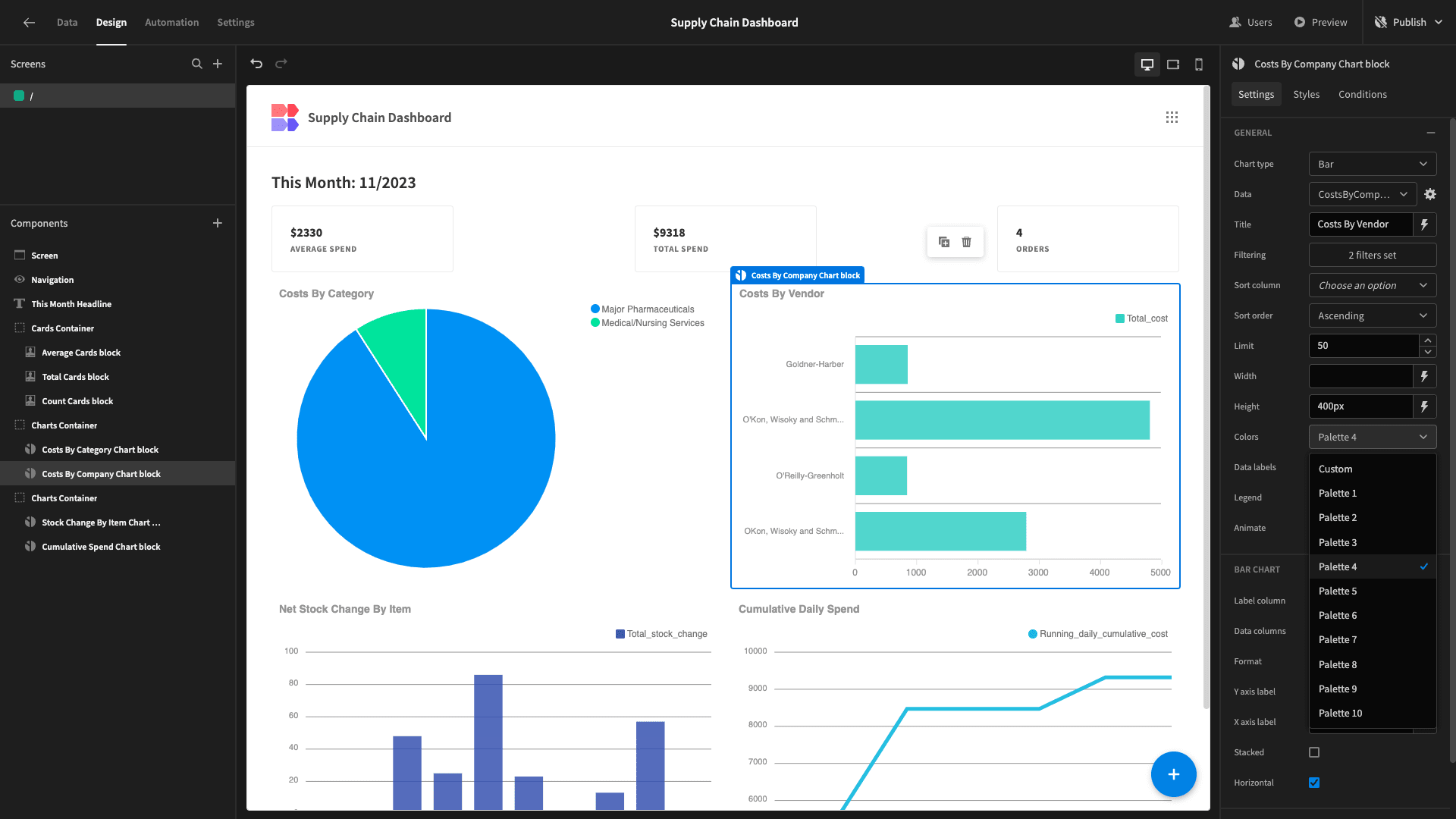
Then, we’ll play with the color palette fields on each of our charts to better differentiate them:
When we’re happy, we can publish our app to push it live:
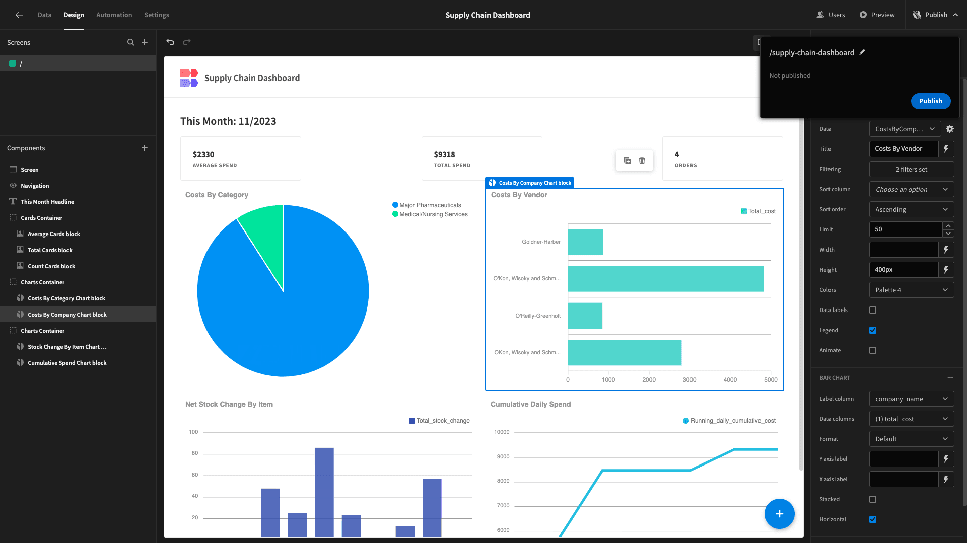
And here’s a reminder of what the finished product looks like:

If you enjoyed this tutorial, check out our guide on how to build a warehouse dashboard .